Accessible Star Rating Widget for Developers: CSS Fills, No JavaScript
Accessible Star Rating Widget for Developers: CSS Fills, No JavaScript

A star rating widget is a UI component that either captures a user’s feedback (an interactive input) or shows an aggregate score to visitors (a read-only display). For input, build accessible radio groups following the W3C pattern. For display, render fractional fills with CSS gradients and background-clip instead of loading extra images.
TL;DR:
- Most static display ratings can be rendered with CSS gradients and background-clip, avoiding extra image requests and layout shifts, improving load times.
- Accessible interactive ratings must follow W3C ARIA patterns with native radio inputs or ARIA equivalents, supporting keyboard navigation and screen readers.
- Pure HTML and CSS solutions are lightweight and simple but may lack flexibility; component libraries add features but also increase bundle size.
- For fractional star fills, calculate the fill percentage by dividing the rating by maximum stars and apply it via CSS gradients or clip-path techniques for precise visualization.
- Using a widget builder like Zyff allows easy creation and embedding of accessible, customizable rating badges without coding, streamlining implementation for non-developers.
Table of Contents
- What Does a Star Rating Widget Actually Do?
- How Do You Build a Star Rating Widget?
- What Accessibility Rules Apply to Star Ratings?
- How Do You Render Fractional Stars With CSS?
- How Should You Customize a Star Rating Widget?
- What’s the Best Way to Embed a Rating Widget?
- What Do Working Code Examples Look Like?
- Why Zyff Fits the Embed Pattern Described Here
- Is CSS-First the Right Call, or Overkill?
- Get a Star Rating Widget Live Without Writing the CSS Yourself
- Where to Go Deeper on Standards
- Sources
- FAQ
What Does a Star Rating Widget Actually Do?
A rating widget covers two distinct jobs, and mixing them up is the most common implementation mistake. The interactive version lets a visitor click or tap to submit an opinion, like a five-star input on a checkout confirmation page. The read-only version just displays an aggregate, like “4.7 out of 5” on a product card. The five-star convention persists because it is universally understood; a nonstandard icon set like hearts or mugs measurably erodes trust for product reviews since shoppers have to pause and decode what the icon means before they can decode the score itself.
Common placements include:
- Product cards in a grid, where the fractional average sits next to the price.
- Post-purchase or support-ticket modals, where the interactive input captures new feedback.
- Site footers or “wall of love” sections, showing an aggregate for social proof.
- Internal dashboards, where staff rate support interactions or content quality.
How Do You Build a Star Rating Widget?
You have four realistic paths, and the right one depends on whether you need input, display, or both.
- Pure HTML/CSS radios. A
fieldsetwith five radio inputs styled as stars gives you an accessible interactive control with zero JavaScript. The browser handles focus and selection state natively. - SVG or glyph-based rendering. Inline SVG stars or an icon font let you scale crisply at any size without extra network requests, which matters for a component repeated dozens of times on one page.
- Component libraries. Chakra UI’s rating component and similar kits like shadcn expose props such as
count,allowHalf,readOnly, andicon, so a React or Next.js app gets a controlled, themeable widget in a few lines. - Third-party widget builders. For teams without dedicated frontend engineers, a hosted embed script trades some customization control for speed.
Each path has real tradeoffs. Pure CSS radios are the lightest on payload and layout stability, since there’s no async render step to cause a layout shift. Component libraries add bundle weight but simplify state management when a rating needs to sync with a cart, a form, or a backend call. SVG assets sit in between: fast to render, but you’re responsible for wiring up the accessibility attributes yourself rather than inheriting them from a library.
What Accessibility Rules Apply to Star Ratings?
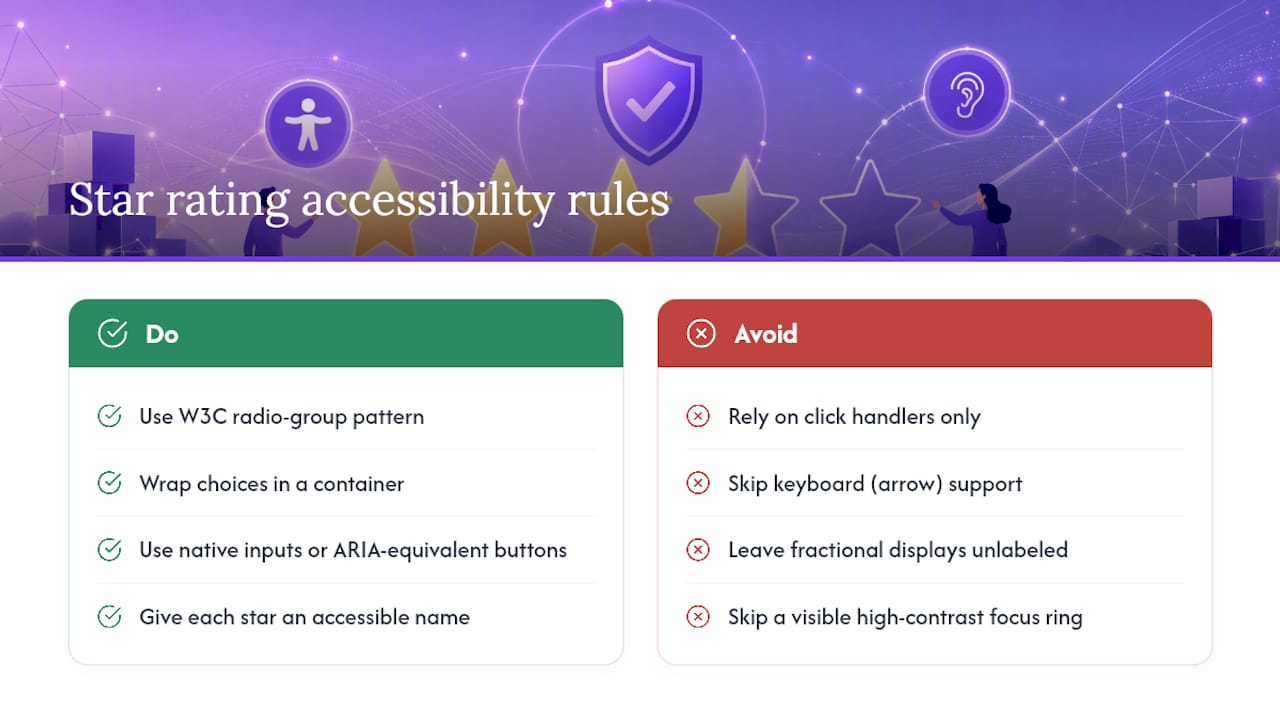
Interactive rating widgets should follow the W3C’s radio group pattern to get keyboard support and screen reader announcements right on the first try. That means wrapping the five choices in a container with role="radiogroup", using native <input type="radio"> elements or an ARIA-equivalent button pattern, and giving each star its own accessible name, like aria-label="3 stars".
Keyboard behavior is not optional. Users expect arrow keys to move selection across the group, matching how any native radio set behaves; if you build a custom button-based version instead of native radios, you need roving tabindex to keep that behavior intact. Skipping this step is the most common reason custom rating widgets fail an accessibility audit: click handlers alone leave keyboard and screen-reader users stranded.
For read-only fractional displays, there’s no interaction to manage, but there is still a meaning problem. A visual fill of 4.2 stars means nothing to a screen reader unless you pair it with role="img" and aria-label="Rated 4.2 out of 5", or expose a plain-text status like “Average rating: 4.2 out of 5” alongside the graphic. Developer guidance on rating input patterns recommends this visible or programmatic label as standard practice, not an edge case. Finally, don’t skip the focus ring. A default browser outline is ugly, but a custom one with adequate contrast is required for anyone navigating by keyboard.
How Do You Render Fractional Stars With CSS?
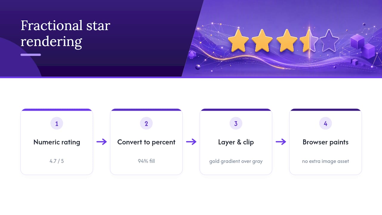
The formula behind every fractional star display is simple: percentage = (rating / max_stars) * [100%](https://medium.com/@rjbalaji92/fractional-star-rating-d0677d434577). A 4.7 rating out of five stars becomes a 94% fill.
From there, CSS gradients paired with background-clip let you clip a gold fill layer to that exact percentage, stacked over a gray, unfilled star layer underneath. Layered SVG works the same way if you’d rather manage the fill as a clip-path than a gradient. Either approach means the browser paints the partial star, so there’s no fourth image asset for “star at 70%” cluttering your CDN.
This matters more for performance than it sounds. A CSS-based fill loads with the page’s existing stylesheet, so there’s no extra network request and no layout shift while an image loads in. That’s a real, measurable improvement in perceived speed on pages with dozens of rated items, like a search results grid. Reach for JavaScript only when you need something CSS genuinely can’t do, like animating the fill on scroll or recalculating the percentage from a live vote count on the client.
How Should You Customize a Star Rating Widget?
Stick with conventional five-star iconography for anything resembling a product or service review; it’s the one glyph set shoppers read instantly without a label. If you do use a nonstandard icon, like a thumbs-up scale or a numeric slider, label it explicitly so the meaning isn’t left to guesswork.
Touch targets matter more than most developers assume. A star rendered at 16 pixels looks fine on desktop but becomes nearly impossible to tap precisely on a phone; give each star a hit area of at least 44 by 44 pixels even if the visible icon is smaller. Contrast and focus styling still apply here too, since a customized widget is exactly where accessibility regressions creep in.
One real design decision: do you show the numeric score next to the stars, or let the visual carry the message alone? Showing “4.7 (312 reviews)” next to the graphic builds more trust than stars alone, since it signals the rating comes from a real sample size rather than a placeholder.
Pro Tip: If you support half-star precision (an allowHalf prop in most component libraries), round to the nearest 0.5 rather than displaying raw decimals like 4.73 — it reads as more intentional and is easier to scan at a glance.
What’s the Best Way to Embed a Rating Widget?
Most modern widgets ship as a single script tag with data-* attributes controlling the rendered output, a pattern that’s become the de facto standard for lightweight embeds. A typical tag might carry data-rating, data-count, data-accent, and data-link attributes, letting the script render a fully styled badge without you writing markup by hand.
This one-line approach drops cleanly into a CMS content block, a Shopify theme file, or a plain HTML page, which is exactly why it’s become common for review badges specifically. If the widget also captures new votes, server-side protection isn’t optional: verify submissions against a session token or cookie, and rate-limit by IP or account to stop bot-inflated scores. And if you’re only displaying an existing aggregate rather than collecting new input, skip the interactive version entirely. A read-only embed is lighter, has no state to manage, and removes an entire category of validation and spam concerns.
What Do Working Code Examples Look Like?
Three patterns cover almost every real implementation need.
- Accessible interactive input (HTML/CSS). Wrap five radio inputs in a
fieldsetwithrole="radiogroup", label each witharia-label="X stars", and style the checked and hover states with adjacent-sibling selectors so no JavaScript is required for the visual state. - Read-only fractional display (CSS). Set a custom property like
--rating: 94%on a wrapper, then use it inside abackground-clip: textor gradient stop to fill a star glyph layer to that exact width. Pair the visual witharia-label="Rated 4.7 out of 5". - React component pattern. Structure the component around a controlled
valueprop, ahoverstate for preview-on-mouseover, areadOnlyboolean to disable interaction entirely, and anallowHalfflag, mirroring how Chakra UI’s rating component is structured.
Adapting any of these to Shopify or WordPress usually means pasting the CSS into the theme’s custom stylesheet and the markup into a template snippet or content block, rather than rewriting the logic.
Why Zyff Fits the Embed Pattern Described Here
Everything above assumes you’re comfortable writing markup, wiring ARIA attributes, and maintaining CSS. If that’s not where your team wants to spend time, Zyff builds on the same single-line embed pattern covered in the integration section, minus the manual coding.
Zyff is a website widget builder that uses a single line of embed code to work with various site builders, designed for businesses seeking to showcase customer reviews and engage visitors without needing to write code themselves. It also offers access to multiple free tools that remain unmetered regardless of the plan, which helps users test widgets before choosing a paid subscription.
For a store owner who read this far and thought “I don’t want to hand-code an ARIA radiogroup,” a builder like this closes that gap directly: design the widget, preview the fill and color states, copy the embed, done.
Is CSS-First the Right Call, or Overkill?
Most articles on this topic treat accessibility and performance as separate checklists: one section on ARIA roles, another on load time, rarely connected. That’s backwards. A widget built with native radios and CSS gradient fills gets both for free, because the browser is doing the heavy lifting instead of a JavaScript framework re-rendering on every hover.
Where conventional advice falls short is the instinct to reach for a component library by default. Libraries like Chakra UI earn their weight when a rating needs to sync with cart state, a form, or a live API, not for a static badge sitting in a footer. Loading a full component runtime to display “4.7 out of 5” once per page is the kind of decision that looks modern and performs worse than five lines of CSS.
If you take one thing from this, prioritize the accessible markup first, styling second, and JavaScript last, only when the interaction genuinely demands it. Test with a keyboard before you test with a mouse. Most accessibility failures in rating widgets aren’t subtle; they’re just never checked.
— Ashok
Get a Star Rating Widget Live Without Writing the CSS Yourself
Everything in this guide, the ARIA roles, the fractional-fill math, the embed attributes, is exactly what Zyff’s Widget Builder handles for you behind a design-and-copy workflow.
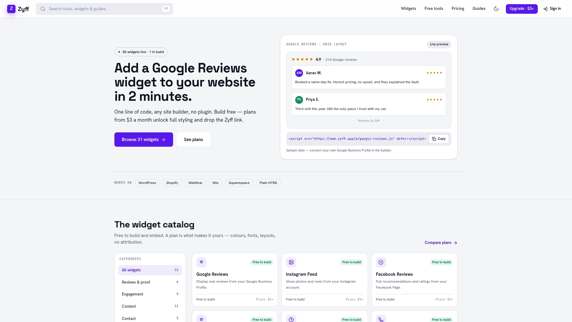
The process runs in three steps: design the widget’s look in the builder, preview how it renders with real sample data, then copy a single embed line onto your site. If you’re on a code-first stack, the HTML, React, and Next.js install guide walks through where that line goes. If you’re managing a WordPress or Shopify storefront instead of a custom codebase, the same builder output drops into either without touching a template file. All 49 tools, including the widget builder itself, are free and unmetered on every plan; paid tiers like Pro at $6 per month only come into play once you want Zyff branding removed or need to save more than the free limit of widgets. Start by opening the widget builder and previewing a star rating badge with your own product data.
Where to Go Deeper on Standards
For the accessibility pattern behind interactive ratings, the W3C’s ARIA radio-group rating example is the primary reference. For fractional-fill CSS techniques, CSS-Tricks’ rundown of five rating methods remains the clearest walkthrough of gradient and clip-path approaches.
Sources
FAQ
What’s the difference between an interactive and a read-only rating widget?
An interactive widget captures new input, like a customer submitting a five-star review, and needs full keyboard and ARIA support. A read-only widget just displays an existing aggregate score and only needs a text label like “4.7 out of 5” for screen readers, not a focus state.
Do I need JavaScript to build a star rating widget?
No. A pure HTML/CSS radio group handles interactive input natively, and CSS gradients with background-clip render fractional read-only displays without any script. JavaScript is only necessary for animated fills or client-side recalculation.
How do you calculate a fractional star fill in CSS?
The formula is percentage = (rating / max_stars) * 100%, so a 4.7 out of 5 rating becomes a 94% fill applied through a CSS gradient or background-clip technique. That percentage clips a colored star layer over a gray unfilled layer beneath it.
What ARIA attributes does a star rating input need?
Wrap the stars in a container with role="radiogroup", use native radio inputs or an accessible button pattern, and give each star an aria-label like “4 stars” following the W3C’s radio rating pattern. Keyboard arrow-key support has to work the same way it does on any native radio group.
Can I add a star rating widget without writing custom code?
Yes. Zyff’s Widget Builder lets you design and preview a rating badge, then copy a single embed line onto any site builder without touching HTML or CSS directly. Current pricing for saved widgets and branding removal is listed on Zyff’s pricing page.