Designers: Portfolio Grid Layout That Wins Clients With One Line Embed
Designers: Portfolio Grid Layout That Wins Clients With One Line Embed

For most designers, a consistent three or four-column box grid with one featured tile and clean responsive breakpoints beats a fussy masonry layout nine times out of ten. Reach for masonry only when your work is photography-heavy and visual rhythm matters more than scanability. Skip custom packery grids unless you have the CSS patience for them. The tradeoffs and build steps are below.
TL;DR:
- A three or four-column box grid with consistent aspect ratios remains the most versatile and professional choice for most portfolios, especially for UI designers, developers, and agencies.
- Masonry layouts are ideal mainly for photography and illustration work, but they can appear chaotic if images vary widely in quality or color.
- Responsive breakpoints and image optimization, including WebP format and lazy loading, are essential to keep image-heavy grids fast on mobile devices.
- Using a fixed aspect ratio across all tiles and prioritizing the first two pieces helps avoid an amateur look and engages viewers quickly.
- Zyff’s free portfolio widget offers a simple way to implement a responsive, filterable grid without coding, making it accessible for most users.
Table of Contents
- Which Portfolio Grid Layout Fits Your Work?
- Design Rules That Make Any Grid Look Intentional
- How Do You Keep an Image-Heavy Grid Fast on Mobile?
- How Do You Actually Build a Portfolio Grid?
- Adding a Filterable Portfolio Widget Without Writing CSS
- Three Grid Patterns You Can Copy Today
- What Actually Wins You the Client
- Try Zyff’s Free Portfolio Widget
- Sources
- FAQ
Which Portfolio Grid Layout Fits Your Work?
Every portfolio grid layout falls into one of five families, and picking the wrong one is the fastest way to make strong work look sloppy.
A standard box grid locks every tile to the same aspect ratio and spacing. It reads as organized and professional, which is why UI designers, developers, and consultants lean on it. The tradeoff is that it flattens visual drama, since a sprawling landscape photo gets cropped the same as a tight product shot.
Masonry lets tile height vary based on the image’s natural proportions, stacking items in whatever order fits the column best. Photographers and illustrators favor it because it preserves each image’s real shape. The catch is that masonry’s uneven bottom edges can look chaotic if your images vary wildly in quality or color.
Packery (a physics-based variant of masonry) adds draggable, size-variable tiles that resize and reflow. It is the most expressive option and the hardest to implement without a dedicated grid plugin, since building it from scratch means writing your own collision detection.
Split-screen layouts pair a large hero image against a scrolling list, ideal for single case-study presentations rather than a gallery of many projects.
Card hybrids blend a grid with card-style metadata (title, tags, a short blurb) baked into each tile, which suits agencies and freelancers pitching multiple services at once.
- Standard grid: best for UI/UX portfolios, consulting sites, and multi-project overviews.
- Masonry: best for photography, illustration, and mixed-orientation image sets.
- Packery: best for design studios wanting an editorial, magazine feel.
- Split-screen: best for deep single case studies.
- Card hybrids: best for freelancers mixing visual work with service descriptions.
Design Rules That Make Any Grid Look Intentional
The single biggest fix for an amateur-looking grid is enforcing one aspect ratio across every tile. A 1:1 square, a 4:3 landscape, or a 16:9 widescreen all work, but mixing them creates visual static that undermines even the best photography. Visual Portfolio’s documentation recommends picking one ratio and cropping everything to match rather than letting each image dictate its own shape.
Thumbnail composition matters almost as much as the crop itself. Keep the subject centered in a “safe zone” so hover overlays and captions never cover the part of the image doing the work.
Hierarchy comes from size and placement, not decoration. A single larger “lead” tile at the top of the grid, sized roughly double the others, pulls the eye to your best piece without needing a banner or an intro paragraph, a pattern Shadcn UI’s portfolio blocks use to guide viewers toward featured work.
- Clamp captions to two lines maximum so uneven text length never breaks tile height.
- Use short tag labels (“Branding,” “React,” “Print”) instead of full sentences under each thumbnail.
- Reserve badges (like “New” or “Case Study”) for one or two tiles at most, or they lose meaning.
- Keep hover effects subtle: a slight lift and a soft gradient veil read as polished; a full color flip reads as dated.
Pro Tip: Test your grid with your five worst images, not your five best. If it still looks clean with weak content, it will look outstanding with strong content.
How Do You Keep an Image-Heavy Grid Fast on Mobile?
A portfolio grid layout with dozens of high-resolution images can tank your load time if you do not plan for it. The fix starts with breakpoints, not image compression alone.
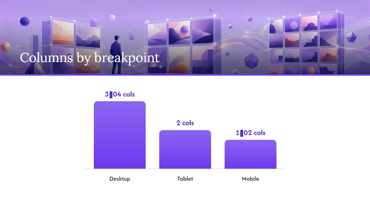
- Set desktop to three or four columns, tablet to two, and mobile to one or two, a reduction pattern that Visual Portfolio and most grid plugins recommend preserving visual balance across screen sizes.
- Serve responsive images with
srcsetandsizesattributes so phones do not download desktop-sized files. - Convert your source images to WebP or AVIF, which typically render at a fraction of JPEG’s file size at equivalent quality.
- Lazy-load every tile below the fold, but priority-load your featured hero tile so it appears instantly.
- Skip heavy CSS animations on scroll. Use
transforminstead oftop/leftpositioning, which forces the browser to repaint the whole layout.
Statistic Callout: Portfolio sliders built for responsive breakpoints, like Swiper Studio’s portfolio configurations, expose multiple breakpoint tiers so you can swap from a grid to a single-item carousel when columns start feeling cramped.
Accessibility deserves the same attention as performance. Every thumbnail needs descriptive alt text (not “image1.jpg”), lightbox modals need keyboard focus trapping so users can tab through and exit with Escape, and filter buttons need ARIA labels announcing the active category to screen readers.
How Do You Actually Build a Portfolio Grid?
You have three realistic paths, and the right one depends on how much time you want to spend on CSS.
WordPress users get the fastest start with a dedicated block or plugin. Powerfolio’s grid plugin exposes masonry, box, and packery layouts with column counts from two to six, filters, and shortcode placement, all without touching code. If you prefer the native editor, Gutenberg’s Portfolio Block offers grid, masonry, and card hover layouts with responsive controls built in, so you never leave the block editor to adjust columns.
If you want full control and are comfortable coding, a standalone component in React with Tailwind CSS, or a vanilla JavaScript module, gives you custom filtering, modal detail views, and search. Open-source showcase grids on platforms like GitHub demonstrate how far a hand-built grid can go, including keyboard navigation baked in from the start.
The third path, an embeddable widget, is the fastest when you need something live today across a WordPress site, a Squarespace store, or a custom-coded homepage. After installing any of these, adjust in this order:
- Column count for desktop, tablet, and mobile.
- Aspect ratio for every thumbnail.
- Filter categories and how many show by default.
- Hover effect style.
- Lazy-loading toggle for offscreen images.
Adding a Filterable Portfolio Widget Without Writing CSS
Zyff’s portfolio widget maps directly onto the rules above: category filters, a built-in lightbox, responsive column counts, and lazy loading are all configuration toggles rather than code you have to write. You pick your column count and aspect ratio, upload images with categories attached, turn on lazy loading, and copy one line of embed code onto your site. The filter and lightbox behavior mirror what dedicated WordPress plugins offer, minus the plugin installation step.
Three Grid Patterns You Can Copy Today
Three configurations cover most portfolio needs, and each one maps to a specific setting checklist.
Pattern A, the standard card grid: three columns, 4:3 aspect ratio, two-line caption clamp, subtle lift on hover. Works for consultants, developers, and multi-service freelancers.
Pattern B, the masonry gallery: variable-height tiles, tight 8px gutters, click-to-expand lightbox. Works for photographers and illustrators with mixed-orientation shots.
Pattern C, feature-first mixed grid: one hero tile at double size, a standard grid beneath it, category filters above. Works for designers who have one standout project they want everyone to see first.
| Pattern | Columns | Aspect ratio | Best for |
|---|---|---|---|
| Standard card grid | 3 desktop / 1 mobile | 4:3 | Multi-service portfolios |
| Masonry gallery | Variable | Native/mixed | Photography, illustration |
| Feature-first mixed | 1 hero + 3 grid | 1:1 for grid tiles | Single standout project |
What Actually Wins You the Client
Most portfolios fail not because the grid is ugly but because it buries the good work under too much of it. Show six to eight pieces, not twenty five. Make your first two tiles count, since that is often all a hiring manager or client actually scrolls through before deciding. Save packery and split-screen experiments for when your work itself is visually loud enough to justify the extra complexity, otherwise a clean box grid will outperform a clever one.
— Ashok
Try Zyff’s Free Portfolio Widget
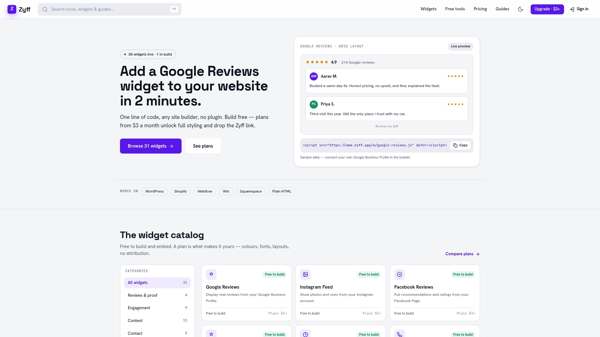
Zyff gives you a filterable, responsive portfolio grid without writing a line of CSS, and unlike most plugin-based builders, the core widget stays free with no watermark limits tied to your plan. You set columns and aspect ratio, drop in your categories, and paste one script tag into your site’s code, whether that site runs on WordPress, Squarespace, or plain HTML.
If you are still weighing implementation paths, open the widget builder and preview how your images look in a live grid before committing to anything. Need a lightbox for detail views too? The photo gallery widget pairs naturally with a portfolio grid for larger image sets. For designers who want a fully custom build instead, local studios like this web design service can hand-code a bespoke layout from scratch. When you are ready to remove branding or manage more saved widgets, check Zyff’s pricing starting at $3 a month.
Sources
- Portfolio Grid Design — Powerfolio (WordPress plugin)
- Standard Grid | Shadcn UI Blocks — Portfolio project displays
- Swiper Studio for portfolios
- Grid layout — Visual Portfolio documentation
FAQ
How Should I Lay Out My Portfolio?
Group your strongest six to eight pieces in a consistent grid with one enforced aspect ratio, and put your best work in the first two tiles since that is where attention concentrates. A box grid works for most disciplines; masonry suits photography-heavy portfolios better.
What Is a Grid Layout Example?
A standard grid layout example is a three-column arrangement where every image crops to the same 4:3 ratio, with a short caption and tag beneath each tile, as seen in Shadcn’s standard grid pattern. Masonry is another common example, where tile height varies based on each image’s natural proportions.
What Are the Four Types of Grids?
The four most common grid types in portfolio design are the standard box grid, masonry, packery (a size-variable, physics-based masonry), and split-screen layouts for single case studies. Each fits a different content style, from uniform UI shots to varied photography.
What Is the Best Portfolio Template?
There is no single best template since it depends on your discipline. A three or four-column box grid with a featured hero tile works well for consultants and multi-service freelancers, while photographers typically get more mileage from a masonry template like the one described in Visual Portfolio’s documentation. Zyff’s free portfolio widget covers both approaches through its column and layout settings.