One Per Session Popup Best Practices for Conversions, UX and WCAG
One Per Session Popup Best Practices for Conversions, UX and WCAG

Show a popup only after a visitor has seen real value on the page, never on arrival. Use non-blocking formats like slide-ins or banners for mobile and organic search traffic, cap frequency to one per session, and build every overlay to WCAG standards. Measure the result against bounce and dwell time before calling it a win.
TL;DR:
- Popups should trigger only after visitors have gained initial value from the page, using delays, scroll depth, or engagement signals, especially on mobile.
- Using non-intrusive formats like banners or slide-ins for mobile and organic traffic reduces user frustration and search ranking risks.
- Design and copy should focus on a clear, single CTA with contrast, relevant offer framing, and filtered targeting based on referral source or visitor behavior.
- Accessibility requires proper roles, focus management, background inertness, and easy dismissal to prevent blocking users with assistive technology.
- Test popup triggers and designs with comprehensive metrics, including bounce and dwell time, to balance short-term conversions with long-term trust and SEO health.
Table of Contents
- 1. Popup types and when to use each
- 2. When should you trigger a popup, and how often?
- 3. Design, copy, and offer framing that converts without annoying visitors
- 4. Mobile popup best practices
- 5. Accessibility and legal considerations for popups
- 6. Targeting and personalization: show the right message to the right visitor
- 7. Testing and measurement: run safe A/B tests and monitor SEO impact
- 8. Examples and templates: copy, trigger, and why they work
- 9. Implementation checklist and developer handoff
- Balancing short-term lift against long-term trust
- How our popup widget helps you test these patterns faster
- FAQ
- Sources
1. Popup types and when to use each
Not every message needs a full-screen takeover. The format you pick should match the intrusiveness the moment can tolerate and the value you are offering in return.
A modal sits on top of the page and blocks interaction with everything behind it until closed. It demands the most attention and carries the highest accessibility burden, since it must trap focus and restore it correctly when dismissed. A non-modal overlay behaves similarly but allows the visitor to keep scrolling or clicking around it, which lowers friction but also lowers visibility. A banner runs along the top or bottom of the viewport, never covers content, and works well for cookie notices or site-wide announcements. A slide-in eases in from a corner or edge, usually after scroll or time triggers, and feels less aggressive than a modal while still grabbing attention. A toast is a brief, auto-dismissing notice, often used for confirmation messages rather than conversion asks. A two-step popup opens with a soft CTA button and only shows the form field after a second click, which filters for intent before asking for information. A full-screen interstitial takes over the entire viewport and is the format most likely to trigger usability and ranking problems, especially on mobile.
Matching format to use case matters more than picking the flashiest option:
- Newsletter signup: slide-in or two-step popup triggered by scroll depth or time on page.
- Cart recovery: exit-intent modal, limited to e-commerce checkout flows where intent is already high.
- Age-gate or legal disclosure: full-screen interstitial, acceptable here because the content genuinely cannot be shown without it.
- Cookie consent: compact banner, never a blocking modal, since it should not stand between a new visitor and the content they came for.
- App install prompts: small banner or toast, since full-screen app interstitials are explicitly flagged as a mobile usability risk.
Each format trades off intrusiveness against conversion potential. Modals convert best per impression but frustrate the most visitors when mistimed; banners annoy almost no one but get ignored at a higher rate. NN/g’s research on popups found that showing any overlay before a visitor can see the page’s value is a recurring usability failure, regardless of format.
2. When should you trigger a popup, and how often?
Timing is the single biggest lever in whether a popup feels helpful or feels like an ambush. The rule from usability research is simple: let people glean some value from the page first.
- Time delay: wait a reasonable period on content-heavy pages before firing any popup, longer for long-form articles.
- Scroll depth: trigger after significant scroll on blog posts or product pages, signaling real reading engagement rather than a bounce-prone glance.
- Page view count: show acquisition popups only on a visitor’s second or third pageview in a session, not the first.
- Explicit interaction: fire two-step popups only after a click on a visible CTA button, never automatically.
- Exit intent: reserve exit-intent triggers for cart pages or high-value content, since they fire right as a visitor is already leaving.
Frequency caps matter just as much as the trigger itself. A visitor who dismisses a popup should not see it again for the rest of that session, and a reasonable cooldown of several days before showing the same offer again prevents repeat-visitor fatigue. NN/g recommends delayed and contextual triggers specifically because premature popups measurably lower conversion rates, not just goodwill.
Organic mobile entries deserve extra caution. A visitor landing from a search result expects to see the content that ranked, not an overlay standing between them and it. Delay any popup further on these entry pages, or skip it in favor of a banner, since blocking content on a mobile organic landing page is the exact pattern flagged in search guidance.
Pro Tip: Set your delay and scroll thresholds separately for mobile versus desktop. Mobile sessions are shorter, so a 15-second desktop delay often means a mobile visitor never sees the popup at all, or sees it the instant they land if you use a universal timer.
3. Design, copy, and offer framing that converts without annoying visitors
The format and timing get a popup in front of the right person. What happens in the next three seconds decides whether it converts or gets closed on reflex.
The headline carries the most weight. It should restate or sharpen the value the visitor is already looking for on that page, not introduce a generic pitch.
Below the headline, the CTA needs to stand alone as the one thing you want the visitor to do:
- Single focus: one primary action, one button, no competing links fighting for attention.
- Visual contrast: the CTA button color should stand out clearly from the rest of the popup, not blend into a muted palette.
- Microcopy on the button itself: “Get My 10% Off” converts better than a flat “Submit” because it restates the benefit at the point of action.
- An honest, visible close option: an X or “No thanks” link that is easy to find, not hidden in a tiny corner.
Offer-fit is where most popups fail quietly. A discount code makes sense on a product page. A content upgrade, like a downloadable checklist, fits a blog post far better than a discount would. A product recommendation popup fits a category page where the visitor has already shown purchase intent. Matching the offer to the page context, rather than running one generic popup sitewide, is what separates a popup that feels like a helpful nudge from one that feels like noise.
Two-step and progressive capture patterns reduce friction by splitting the ask into smaller pieces. Instead of showing a name-and-email form the instant someone lands, a two-step popup opens with a single button like “Yes, send me the discount.” Only visitors who click see the actual form. This filters out the people who were never going to convert anyway and makes the remaining form feel like a natural next step rather than a cold ask.

Pro Tip: Write three headline variants before building the popup: one that states the offer, one that states the outcome, and one that asks a question. Test which framing matches your traffic before you invest in design polish.
4. Mobile popup best practices
Mobile screens punish anything that behaves like a desktop popup. A full-screen modal that feels reasonable on a 27-inch monitor can cover the entire visible page on a phone, which is precisely the pattern that creates both usability complaints and search visibility risk.
- Prefer compact formats: a bottom slide-in banner or a small corner toast almost always outperforms a full-screen modal on mobile, since it leaves the content visible and scrollable.
- Size touch targets generously: close buttons and CTAs need enough tappable area that a thumb does not miss and tap through to the wrong element.
- Make dismissal a single tap: no secondary confirmation step, no tiny X buried in a corner that requires zooming to hit accurately.
- Avoid layout shift: a popup that loads after the page has already rendered and shoves content down creates a jarring shift that hurts both the experience and page-stability metrics.
- Keep copy short: mobile popups have less visible space, so a headline that works in two lines on desktop needs to work in one line on a phone.
- Minimize form fields: ask for email only, not email plus name plus phone number, since every extra field compounds the friction of typing on a small keyboard.
Test every mobile popup in portrait orientation first, since that is how most mobile traffic actually arrives. A popup designed and approved in landscape preview often looks completely different, and worse, once it is live on a real device held upright.
5. Accessibility and legal considerations for popups
An inaccessible popup does not just alienate visitors using a keyboard or screen reader. It can also violate WCAG success criteria and, when it blocks mobile content, run against search guidance that specifically targets intrusive overlays.
- Announce it: the popup needs a role of
dialogoralertdialogand an accessible name, usually througharia-labelledby, so assistive technology knows a new interface element has appeared. - Move focus into it: when the popup opens, focus should shift to the first interactive element inside it, not stay wherever it was on the underlying page.
- Trap focus while it’s open: Tab and Shift+Tab should cycle only through elements inside the popup, never escape back to the page behind it.
- Let Esc close it: every popup should close on the Escape key, with no exceptions for marketing-driven “can’t dismiss until you engage” patterns.
- Restore focus on close: when the popup closes, focus returns to whatever element triggered it, so keyboard users are not dropped back at the top of the page.
- Make the background inert: elements behind the popup should not be focusable or readable by a screen reader while the overlay is active.
These six behaviors come from a detailed mapping of modal accessibility requirements to WCAG success criteria, and missing any one of them risks locking out keyboard and screen reader users entirely. The same source notes that WCAG’s timing-adjustable and pause-stop-hide rules apply directly to popups that auto-close or contain moving content: if your popup disappears after five seconds, it needs a way for the visitor to pause or extend that timer.
A six-minute keyboard and screen reader test catches most modal failures before launch, according to the accessible modals guide: open the popup with the keyboard alone, tab through every element to confirm the focus trap holds, press Esc to confirm it closes, check that focus lands back on the trigger element, and zoom to 400% to make sure no controls get cut off or hidden.
On the legal and ranking side, Google’s guidance on mobile content access treats intrusive interstitials that block content right after a visitor arrives from search as a mobile ranking risk. The safe pattern is the same one usability research recommends: let the overlay load after the content is visible, or keep it small and easily dismissed instead of a full-page takeover.
For implementation, native browser APIs remove most of the guesswork. The <dialog> element with its showModal() method promotes the popup to the browser’s top layer and can pair with the inert attribute to make background content genuinely non-interactive, according to developer guidance on accessible dialogs, which recommends the native API over hand-built focus-trap code precisely because it avoids the most common implementation mistakes.
6. Targeting and personalization: show the right message to the right visitor
A popup that ignores where a visitor came from treats a first-time organic reader the same as a returning customer three clicks from checkout. That mismatch is what makes broad, sitewide popups feel tone-deaf.
- Segment by referral source: a visitor arriving from a paid ad already expects a conversion-focused experience, while someone from organic search expects to read first.
- Target by URL path: a popup offering a discount on a pricing page makes sense; the same popup on a careers page does not.
- Use campaign parameters: visitors arriving from an email campaign about a specific product can see a popup tied to that exact product rather than a generic site offer.
- Read in-session signals: pages visited this session and cart state tell you far more about intent than any static rule, so a visitor who has added an item to cart deserves a different message than one still browsing the homepage.
- Hold back on new organic visitors: someone landing from a search result for the first time should see contextual, low-friction offers, not a sitewide acquisition popup, since that is the exact scenario usability and search guidance both flag as risky.
- Respect consent signals: where a visitor has opted out of tracking or marketing cookies, personalization has to fall back to context-only targeting rather than history-based targeting.
Behavioral targeting works best when it is additive to the content triggers already in place, not a replacement for them. A returning visitor who has browsed three product pages this session is a stronger candidate for a discount popup than a brand-new visitor on their first page, even if both hit the same scroll-depth threshold.
7. Testing and measurement: run safe A/B tests and monitor SEO impact
A popup test that only tracks conversions is measuring half the picture. The other half, bounce rate, dwell time, and organic landing-page performance, determines whether a short-term lift is actually worth keeping.
Primary and secondary metrics to track together:
- Conversion rate on the popup’s specific goal, whether that’s an email capture or a discount redemption.
- Bounce rate on pages where the popup runs, to catch visitors leaving in frustration.
- Dwell time on the page, since a popup that cuts reading time short is a warning sign even if it converts.
- Organic entrances to the tested pages, tracked separately from paid or direct traffic.
A sound experiment design starts with a clear hypothesis, for example “delaying the popup from 5 to 15 seconds will reduce bounce without meaningfully reducing conversions.” Check that your traffic volume can reach statistical significance in a reasonable window before launching, and define your rollout plan (a percentage split, then a full rollout) before you start, not after you see early results.
CRO and SEO performance need to be watched in the same dashboard during any overlay test, not two separate ones reviewed weeks apart. Teams running popup experiments should monitor organic mobile landing pages and engagement metrics throughout the test, since testing overlay changes without that visibility can produce a conversion win on paper while quietly costing organic traffic over the following weeks.
Set a rollback trigger before you launch: if bounce rate on tested pages rises meaningfully, or if organic entrances to those pages start declining week over week, that is the signal to revert immediately rather than wait out the full test duration.
Pro Tip: Tag every popup variant in your analytics with a consistent naming convention (trigger type, delay value, offer type) from day one. Six months from now, when you want to know which exit-intent variant worked in Q1, a messy event name is the difference between an answer and a guess.
8. Examples and templates: copy, trigger, and why they work
These patterns are starting points to adapt, not scripts to copy verbatim. Each pairs a specific trigger with copy built for that exact moment.
- Content upgrade on a blog post: headline “Get the Checklist Version of This Guide,” triggered at 50% scroll depth. It works because the visitor has already read enough to know the content is useful, so the ask feels like a continuation rather than an interruption.
- Cart abandonment discount: exit-intent trigger paired with a two-step popup, “Wait, here’s 10% off before you go.” It works because exit intent only fires on genuine departure signals, so it reaches people who were already leaving rather than interrupting active browsing.
- Newsletter two-step: soft CTA button reading “Get Weekly Tips,” with the email field appearing only after that click. It works because the two-step structure filters for intent before asking for information, which raises completion rates on the people who do see the form.
- Cookie consent banner: a compact bar at the bottom of the screen instead of a blocking modal. It works because consent is a requirement, not a conversion goal, so keeping it out of the visitor’s way respects both the legal need and the reading experience. Our announcement bar widget format fits this pattern well since it never covers page content.
- Age verification gate: full-screen interstitial with a simple date-of-birth or confirmation prompt, used only where legally required. It is one of the rare cases where a blocking format is the right call, since the content genuinely cannot be shown without it. A dedicated age verification popup handles this without extra custom development.
- Product recommendation slide-in: triggered on a category page after a visitor views three or more products, offering a related item. It works because the trigger itself is a strong purchase-intent signal, so the recommendation feels anticipatory rather than random.
9. Implementation checklist and developer handoff
Handing a popup spec to engineering goes smoother when the requirements are explicit upfront rather than discovered in QA.
- Performance: lazy-load the popup script so it never competes with the page’s largest contentful paint, and keep the bundle small enough that it doesn’t noticeably slow page load.
- Accessibility: set the correct role, wire up
aria-labelledby, implement focus management on open and close, applyinertto the background, and confirm Esc closes the popup. - Analytics: standardize event names across every popup (open, dismiss, convert) and tag each with the experiment or variant name so results stay comparable later.
- QA pass before launch: test keyboard-only navigation, run a quick screen reader spot-check, confirm touch targets are large enough on a real mobile device, and check for layout shift when the popup appears.
Pro Tip: Build one popup component with configurable trigger, copy, and offer props instead of a new popup for every campaign. It cuts QA time in half and means an accessibility fix only has to happen once.
A QA team running through this list benefits from a standardized way of logging what fails and why; a structured accessibility bug report template keeps findings consistent across sprints instead of scattered across ad hoc notes.
Balancing short-term lift against long-term trust
The uncomfortable truth about popups is that the version that converts best this week is often the version that erodes trust the fastest. A tighter delay, a bigger discount, a harder-to-find close button: all of these can lift a conversion number while quietly teaching repeat visitors to distrust your site enough to leave before the popup even loads.
The fix isn’t to avoid testing aggressively, it’s to test with guardrails that catch the damage before it compounds. That means CRO, SEO, and accessibility reviewing the same experiment dashboard, not three separate ones reconciled a quarter later when the organic traffic drop is already a trend line. A popup that passes a keyboard test and holds steady organic entrances while still lifting conversions is a real win. One that converts well but only because visitors can’t find the close button is a debt you’ll pay later.
Document what worked and what didn’t past the headline metric, including the bounce and dwell numbers that often get dropped from the recap deck. That record is what keeps the next team from re-running the same mistake with a different color button.
— Ashok
How our popup widget helps you test these patterns faster
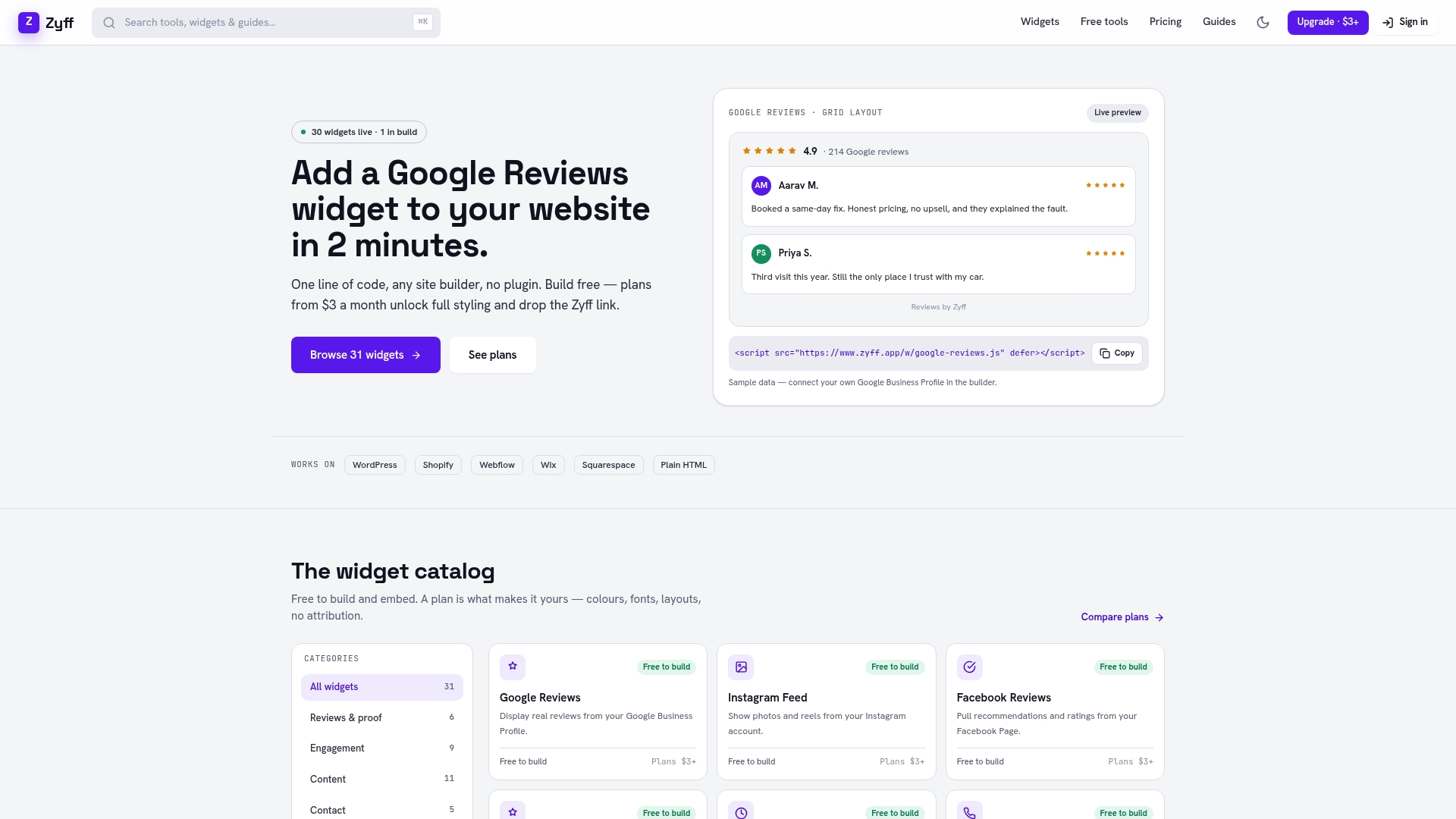
Building a popup that respects every rule above usually means writing custom JavaScript, wiring up focus traps by hand, and hoping the mobile version doesn’t shift your layout. Our popup widget skips that work: you design the trigger, copy, and format in a visual builder and drop in one line of code to embed it on any site, no plugin required.
- Start free: every widget we offer, including the popup builder, is free to create and embed, with no watermark forcing you onto a paid plan just to test an idea.
- Any platform: the same embed code works on Webflow, Wix, Squarespace, or a custom HTML site, so switching platforms later doesn’t mean rebuilding your popup.
- Scale when you’re ready: paid plans start at $3 per month on the Basic tier if you need to save more widgets, extend customization, or remove branding once a pattern proves itself.
Check current plans and pricing or go straight to the popup widget builder to start testing one of the patterns above today.
FAQ
What are some common popup techniques?
Common techniques include exit-intent modals, two-step popups that separate a soft CTA from the form field, scroll-triggered slide-ins, and time-delayed overlays. Each technique pairs a specific trigger with a format suited to that moment, rather than using one popup style across every page.
How do you make sure popups are accessible and not blocked by browsers?
Accessible popups need a dialog role, managed focus, Esc-to-close support, and an inert background, following the modal accessibility checklist mapped to WCAG. Avoiding full-screen interstitials on mobile organic entries also keeps popups in line with Google’s guidance on mobile content access.
Do you need special permission to run a popup on your website?
No special license is required to run a popup, though certain content, like age verification or cookie consent, may carry its own legal disclosure requirements depending on your market and what you’re collecting. Check the specific regulation that applies to your data collection rather than assuming a general popup rule covers it.
What makes a good popup?
A good popup appears only after a visitor has seen the page’s value, matches its offer to the page’s context, and uses a clear single CTA with an easy way to close it. It also holds up under a basic keyboard and screen reader test, since an overlay that traps or confuses assistive technology users undermines the experience it’s meant to improve.
Can Zyff’s popup widget handle exit-intent and scroll triggers?
Our popup widget builder supports configuring triggers like scroll depth and timing when you design the popup, and it embeds with a single line of code on any site. Advanced customization and higher usage limits are available starting at $3 per month on the Basic plan.
Sources
- Popups: 10 Problematic Trends and Alternatives
- Accessible Modals and Pop-ups: What Non-Developers Need to Know