No Code Photo Gallery Widget: Live on Any Site in Minutes
No Code Photo Gallery Widget: Live on Any Site in Minutes

A photo gallery widget is a prebuilt tool you embed on any page with a single line of code, and it handles the layout, lightbox, and responsive sizing for you. The fastest path is to open a no-code gallery builder, pick a layout, drop in your images, and paste the embed snippet into your site. The rest of this guide covers layouts, performance, embedding across platforms, and how to set one up in minutes.
TL;DR:
- Most gallery widgets support multiple layouts including slider, carousel, masonry, and grid, with masonry layouts ideal for photos with varied aspect ratios.
- Incorporating lazy loading, responsive image formats, and avoiding unnecessary scripts can keep galleries fast and mobile-friendly, reducing load times significantly.
- Embedding options typically include a simple script or iframe, with platform-specific methods available for WordPress, Webflow, Squarespace, Wix, Notion, and plain HTML.
- Setting up a gallery involves selecting a layout, uploading images, adding captions and tags, and testing for mobile responsiveness before publishing.
- Using a no-code widget like Zyff’s is recommended for most sites due to its ease, portability, and quick deployment, with custom code reserved for unique or high-scale needs.
Table of Contents
- What Features Matter Most in a Photo Gallery Widget?
- How Do You Keep a Gallery Widget Fast on Mobile?
- How Do You Embed a Gallery on Any Website?
- How Do You Set Up a Gallery Widget Step by Step?
- Which Template Pattern Fits Your Photos?
- Which Gallery Layout Fits Your Website Goal?
- What Should You Know About Privacy and Copyright Before Displaying Photos?
- Do You Need a Widget or a Custom-Built Gallery?
- Build Your Free Photo Gallery Widget With Zyff
- Sources
- FAQ
What Features Matter Most in a Photo Gallery Widget?
The best gallery widgets give you real layout choices, not just one grid. Jotform’s photo gallery widget, for example, supports slider, carousel, grid, and both vertical and horizontal masonry layouts, which tells you these formats have become the standard toolkit rather than niche options.
Here’s what to check for before you commit to a tool:
- Layout variety: grid for uniform rows, masonry for mixed aspect ratios, carousel or slider for a rotating showcase, thumbnail strips for quick browsing, and panoramic options for wide shots.
- Lightbox behavior: clicking a thumbnail should open a full-size overlay with captions, not just a bigger version of the same small image.
- Per-image controls: captions, clickable links, and alt text tied to each photo individually, not applied in bulk.
- Customization: spacing between images, crop versus fit behavior, hover overlays, badges, and tag-based filters for larger collections.
- Templates: prebuilt designs that already handle spacing and typography, so you’re styling instead of building from a blank canvas.
Masonry layouts deserve a specific mention. Because they preserve each photo’s natural aspect ratio and stack images to minimize gaps, masonry grids create a dynamic visual rhythm that a rigid grid can’t match, particularly for photography portfolios where every shot has a different shape. A widget that only offers uniform grids will force you to crop images you’d rather show in full.
How Do You Keep a Gallery Widget Fast on Mobile?
Speed is where most galleries fail, not design. A page loaded with a dozen full-resolution photos can take seconds to render on a phone connection, and visitors rarely wait that long.
Lazy loading solves the biggest part of this problem: images below the fold don’t load until the visitor scrolls near them, so the initial page weight stays light. Pairing that with srcset or the <picture> element lets the browser pick the right image size for the device instead of shipping a desktop-sized file to a phone screen. lightGallery, a widely used gallery and lightbox library, builds in support for responsive images through srcset and the picture element, which is exactly the mechanism that keeps mobile load times reasonable.
A few more practical habits:
Serve WebP images with a fallback format for older browsers, since WebP files are typically smaller than JPEG at comparable quality. Avoid hero images that are needlessly oversized. Make sure the gallery supports touch swipe on mobile and keyboard arrow navigation on desktop. Lightbox plus swipe and keyboard support isn’t a nice extra anymore. It’s table stakes for accessibility and user satisfaction in any gallery built after 2020. Finally, skip heavy autoplay effects or elaborate animation libraries unless they’re genuinely necessary. Every extra script is a tax on load time.
How Do You Embed a Gallery on Any Website?
Most modern gallery widgets give you two embed options, and picking the right one depends on how much control you want.
- One-line script embed: you paste a short snippet of code into your page, and the widget renders itself using JavaScript pulled from the provider’s servers. This is the simplest route and it’s what most no-code builders default to.
- iframe embed: the gallery loads inside a self-contained frame. This isolates the gallery’s styling from your site’s CSS, which helps if your theme has aggressive style rules that might otherwise clash with the gallery’s design.
Platform-specific placement varies a little:
- WordPress: paste the embed into a Custom HTML block, or use your theme’s footer code injection for a site-wide gallery.
- Webflow: add the snippet through the page’s custom code section for full-page control.
- Squarespace and Wix: both platforms offer a code injection panel built for exactly this kind of third-party embed.
- Notion: embed blocks accept most script-based widgets directly.
- Plain HTML: drop the script tag wherever you want the gallery to render in your markup.
Many widget builders now advertise broad platform compatibility, with some claiming support across numerous site hosts through the same embed code. That portability matters more than it sounds: if you ever switch site builders, a widget-hosted gallery keeps working because it’s served independently of your CMS, so you’re not stuck rebuilding it as a plugin on the new platform.
How Do You Set Up a Gallery Widget Step by Step?
Setting up a gallery from scratch takes less time than writing a single email, assuming you’ve already got your photos ready.
- Pick your layout and template. Choose grid for uniformity, masonry for variety, or a carousel if you only want to show a rotating handful of shots.
- Add your images. Upload files directly, import from Google Photos, or paste in image URLs if your photos already live somewhere online.
- Fill in the details. Add alt text for accessibility and search visibility, write captions where they add context, and tag images by category if you’re building a filterable gallery.
- Configure the lightbox. Decide whether clicking an image opens a full-size overlay, links out to a product page, or does nothing at all.
- Fine-tune the visuals. Adjust spacing between images, set crop versus fit behavior, and check how the layout breaks across tablet and phone widths.
- Preview on mobile. Don’t skip this. A masonry layout that looks great on a 27-inch monitor can look cramped on a 6-inch screen if breakpoints aren’t set correctly.
- Copy the embed code. Grab the one-line snippet and paste it into your page’s HTML or your platform’s code injection panel.
- Test the live page. Clear your site’s cache, reload, and click through the gallery yourself to confirm captions, links, and lightbox behavior all work as expected.
Pro Tip: Build the gallery with five or six placeholder images first, publish it, and test on your own phone before you upload the full set. Catching a layout problem early saves you from redoing captions and tags twice.
Which Template Pattern Fits Your Photos?
Masonry wins when your images have inconsistent aspect ratios, which is the norm for photography, event shots, and lifestyle brand content. A rigid grid would force awkward crops on that kind of collection. Grid layouts, by contrast, work better for e-commerce and product rows, where uniform thumbnails help visitors compare items at a glance.
A few smaller details make a bigger visual difference than people expect:
- Set a focal crop point on hero images so faces or key details don’t get cut off at odd breakpoints.
- Use one larger “featured” image at the top of the gallery to anchor the layout before smaller thumbnails follow.
- Add tag filters once a gallery passes roughly 20 images, so visitors can narrow down instead of endless scrolling.
- Keep alt text specific and accurate. It helps both screen reader users and image search visibility.
Pro Tip: If you’re building a portfolio, resist the urge to include every photo you’ve ever taken. A tighter masonry gallery of 15 strong images reads as more professional than 60 mixed-quality ones.
Which Gallery Layout Fits Your Website Goal?
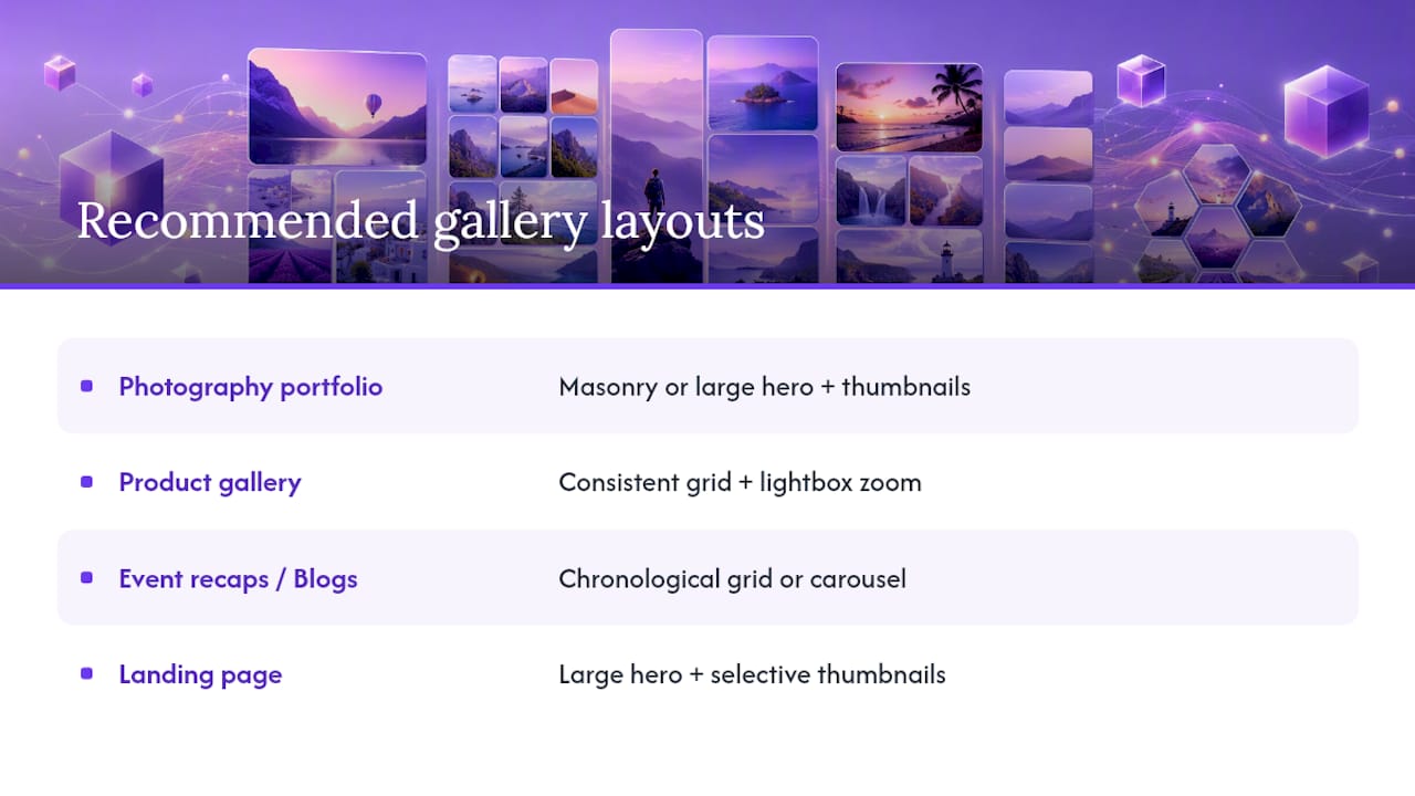
The right layout depends entirely on what the page is trying to do. A photography portfolio benefits from masonry, or a large hero shot paired with a thumbnail strip underneath, since the goal is visual impact rather than comparison shopping.
Product galleries work better as a consistent grid with lightbox zoom on close-ups, letting shoppers scan items evenly before diving into detail shots. Event recaps and blog posts tend to read best as a chronological grid or a simple carousel, since the story unfolds in sequence rather than all at once. Landing pages often do well with one large gallery hero up top and a handful of selective thumbnails below it, keeping the page focused instead of cluttered with every photo you own.
What Should You Know About Privacy and Copyright Before Displaying Photos?
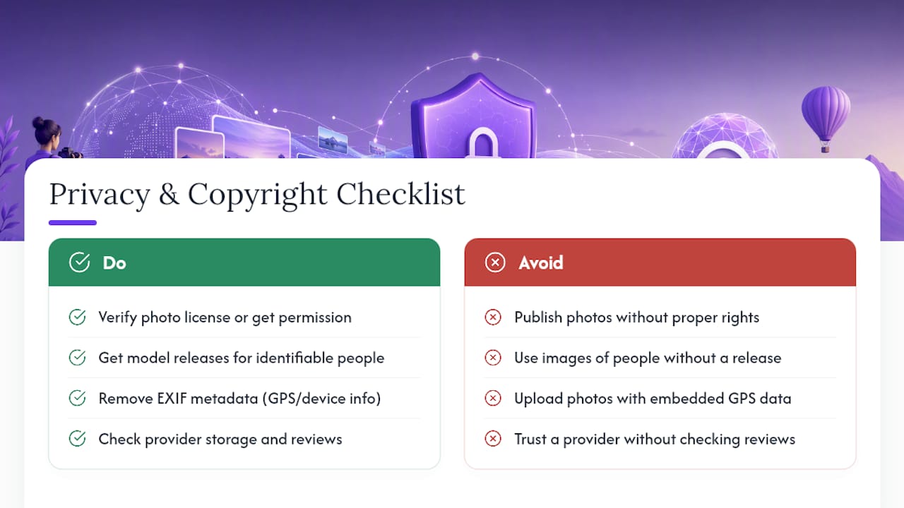
Displaying photos on your website carries legal weight that’s easy to overlook when you’re focused on design. If you didn’t take a photo yourself, you generally need a license or explicit permission to publish it, and stock photo terms vary widely on where and how images can be used commercially.
Photos that include identifiable people raise a separate issue. Depending on your location and the photo’s context, you may need a model release, particularly for commercial use like advertising or product marketing rather than editorial or documentary purposes. This matters more for event photography and customer photo galleries than for product shots of inanimate objects.
Metadata is another overlooked risk. Some images carry embedded GPS coordinates or device information in their EXIF data, and publishing that unmodified can expose more than you intend, especially for photos taken at a private residence or a client’s home.
Before choosing a third-party gallery provider, it’s worth checking how that provider handles your uploaded images and where they’re stored, the same way you’d check reviews before trusting any vendor with your content. Review platforms like Trustpilot can be a useful gut check on a widget provider’s track record before you upload a client’s full photo library to their servers.
None of this means galleries are risky to build. It just means the legal groundwork (rights, releases, and metadata hygiene) belongs in your setup checklist right alongside layout and captions.
Do You Need a Widget or a Custom-Built Gallery?
A no-code widget is the right call for the overwhelming majority of sites. It’s faster to launch, easier to maintain, and portable if you switch platforms later, since the gallery lives independently of whatever CMS you’re running. Custom code only earns its complexity when you need a genuinely unique interaction, like a physics-based drag gallery, or when you’re optimizing for extreme scale that off-the-shelf tools can’t handle.
For everyone else, starting with a widget like Zyff’s photo gallery tool gets you a working, responsive gallery today instead of a development backlog item for next quarter.
— Ashok
Build Your Free Photo Gallery Widget With Zyff
Some providers get you from zero to a published gallery faster than most builders, mainly because there’s no metered tier limiting how much you can use the tool while you’re testing layouts. Many tools offer templates, lightbox behavior, and per-image captions built in, and they run on one line of embed code, so the widget can drop into WordPress, Webflow, Squarespace, Wix, or plain HTML without extra setup work.

Start on the photo gallery widget page, where you can pick a layout, upload your images, and preview the result before anything goes live. If you’re building out a broader visual presence, the portfolio widget with category filters is worth a look too, since it shares the same underlying customization options. Once your gallery looks right in preview, copy the embed snippet and paste it into your site through the WordPress install guide or whichever platform you’re running. From there, it’s live.
Sources
For deeper technical detail beyond this guide, Swiper Studio documents breakpoint configuration for sliders, lightGallery covers responsive lightbox behavior, Flowbite walks through masonry and grid component patterns, and Jotform’s widget guide breaks down practical feature sets for no-code galleries.
- lightGallery - Full featured javascript gallery for web and mobile.
- Photo Gallery Widget for Websites | Jotform Website Widgets
- Tailwind CSS Gallery (Masonry) - Flowbite
FAQ
How do I get a photo gallery widget back on my website?
If a gallery widget disappeared after a theme update or a code cleanup, check whether the embed script is still present in your page’s HTML or custom code section. Re-pasting the one-line embed from your widget provider’s dashboard usually restores it in under a minute.
What’s the best photo gallery layout for a small business site?
A grid layout with lightbox zoom works well for most small business sites, especially for product photos or team shots, since it keeps images uniform and easy to scan. Masonry is worth switching to if your photos have varied aspect ratios, like a mix of portrait and landscape shots.
How do I add a photo gallery to my website without coding?
Use a no-code gallery builder: choose a layout, upload or import your images, customize the spacing and lightbox settings, then copy the one-line embed code into your site’s HTML or code injection panel. Zyff’s photo gallery widget follows exactly this workflow.
Is a photo gallery widget safe to use on my site?
Reputable gallery widgets are safe, but it’s worth checking a provider’s review history and how they store your uploaded images before committing a large photo library to their platform. Stick to established providers with clear privacy documentation rather than obscure plugins with no track record.
Do I need permission to display photos of other people in my gallery?
Yes, in most cases, particularly for commercial use like advertising or marketing rather than editorial content. Photos with identifiable people generally require a model release, and the specific rules depend on your location and how the images will be used.