Turn 4% Into 25%: Email Capture Popup Settings That Close the Gap
Turn 4% Into 25%: Email Capture Popup Settings That Close the Gap
Yes, use an email capture popup. It still works when it targets the right visitor, offers something worth trading an email address for, and asks for nothing more than that address. Skip it, or run it badly, and you leave subscribers on the table or drive them away entirely. The rest of this guide is the checklist, the examples, and the exact settings that separate the two outcomes.
TL;DR:
- Suppress and segment visitors already on your list to prevent redundancy and improve user experience.
- Trigger popups based on behavior such as scroll depth, delay, or exit intent, not on immediate page load.
- Use benefit-focused headlines and CTA buttons that clearly state the reward instead of generic asks.
- Limit sign-up forms to just an email field unless additional information is purposefully needed for segmentation.
- Ensure accessibility features like visible close buttons and keyboard navigation are built into every popup template.
Table of Contents
- What Makes an Email Capture Popup Convert?
- Which Popup Type Fits Your Goal?
- How Should Popup Copy and Design Look?
- When and How Often Should Popups Appear?
- How Many Fields Should a Signup Form Ask For?
- How Do You Keep Popups Accessible and Non-Disruptive?
- What Should You Measure First?
- What Happens After Someone Signs Up?
- What Do Successful Email Capture Popups Look Like?
- The Zyff Perspective on Popup Design
- Try the Zyff Popup Widget on Your Own Site
- Sources
- FAQ
What Makes an Email Capture Popup Convert?
An email capture popup is a triggered on-page prompt asking a visitor to join a mailing list, usually in exchange for a discount, a guide, or early access to something. Marketers also call it a lead capture popup, an email subscription popup, or a newsletter signup popup depending on the goal, but the mechanics are identical: a form, a trigger, and an offer. The best-performing versions share six habits.
Suppress and segment before you write a word of copy. Nothing wastes goodwill faster than asking an existing subscriber to sign up again. Exclude anyone already on your list, and split remaining visitors by behavior, page, or source so the offer matches what they’re actually looking at. This is one of the most overlooked technical controls in the whole setup, and fixing it improves the experience immediately, according to Klaviyo’s email popup guidance.
Trigger on behavior, not on page load. A popup that fires the instant someone lands on your site reads as desperate. Wait for a scroll milestone, a set delay, or exit intent, so the prompt shows up after the visitor has shown some interest.
Lead with a headline that states the trade, not the ask. “Join Our Newsletter” tells the visitor nothing about what they get. A benefit-first headline plus a CTA that names the reward performs far better, and we’ll get into the exact formula in the next section.
Ask for one field. Email only, first touch. Every additional field you add before the first conversion event costs you completions.
Use progressive profiling only when you’ll actually use the data. If you’re not going to segment by birthday or shopping preference, don’t ask for it. Save extra questions for a second touch, once the person has already opted in once.
Build in accessibility from day one. A visible close button, keyboard navigation that doesn’t trap focus, and ARIA labels on every input aren’t optional extras. Accessibility is one of the few genuinely non-negotiable items on this list, according to Klaviyo, because a popup that traps a keyboard user or ignores a screen reader doesn’t just underperform. It locks people out of your site entirely.
Here’s the condensed version to run against any popup before it goes live:
- Suppress current subscribers and known customers
- Trigger on scroll depth, time delay, or exit intent, never instant load
- Headline states the specific benefit, not the generic ask
- CTA button names the reward (“Get My 10% Off,” not “Submit”)
- Only one required field: email
- Close button is visible and keyboard-accessible
- Every test changes one variable, and you track revenue per subscriber, not just opt-in count
Pro Tip: Run your popup through the Tab key before launch. If pressing Tab doesn’t reach the close button within two or three presses, keyboard users are stuck, and that’s a usability failure most teams never catch until a customer complains.
That last checklist item deserves emphasis. A/B testing a headline against an offer only tells you which one gets more clicks; it doesn’t tell you which one brings in subscribers who actually buy later. Track downstream value, not just the sign-up count, and you’ll avoid optimizing for a metric that looks good in a dashboard and does nothing for revenue.
Which Popup Type Fits Your Goal?
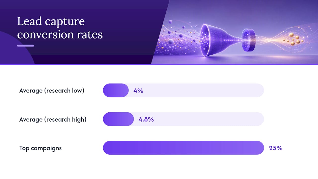
Different popup formats solve different problems, and picking the wrong one for your traffic is the fastest way to waste a good offer. Average lead capture popups convert around 4–4.8% of visitors, though Wisepops reports that top-performing campaigns can convert up to a quarter of visitors. The gap between those numbers usually comes down to format and offer fit, not luck.
-
Discount popups. A straightforward percentage or dollar-amount offer converts well for first-time visitors on e-commerce sites, especially when the discount code appears immediately after sign-up. This is the highest-volume format because it’s the easiest to write and the easiest for visitors to understand, but it also attracts deal-seekers who churn once the code expires.
-
Exit-intent popups. These fire when the visitor’s cursor moves toward the browser’s close button or back arrow, catching someone about to leave without converting. A last-chance offer here recovers traffic you’d otherwise lose outright, and it works particularly well on cart and pricing pages where hesitation is the main barrier.
-
Multi-step quizzes. Instead of one form, the visitor answers two or three quick questions (“What’s your skin type?” or “What’s your budget?”) before entering an email. This produces higher-quality leads because you capture segmentation data upfront, but every extra step adds friction, so completion rates drop compared to a single-field form. Two-step micro-commitment popups can substantially increase engagement, sometimes by multiple factors (https://sleeknote.com/blog/email-popups) over a static form, provided the second step is designed as carefully as the first.
-
Slide-ins and teasers. These appear in a corner rather than covering the screen, making them a better fit for mobile traffic and for visitors mid-read who shouldn’t be interrupted. They convert at a lower rate than center-screen modals, but they cost you far less in bounce rate and reading completion, which matters most on content-heavy pages.
-
Gamified popups (spin-to-win). A wheel or scratch card that reveals a discount code adds a game element that boosts engagement and time-on-popup. The trade-off: the novelty attracts curiosity clicks from people who never intended to buy, so lead quality tends to run lower than with a plain discount form.
Match the format to what the page is actually trying to do. A blog post wants a slide-in. A cart page wants exit-intent. A quiz-friendly niche (skincare, supplements, fitness) can justify the extra friction of a multi-step form because the segmentation pays off downstream.
How Should Popup Copy and Design Look?
Popup real estate is small, so every word and pixel has to earn its place. The headline formula that consistently outperforms generic asks is: benefit plus specificity plus an optional constraint. “10% Off Your First Order, Today Only” beats “Sign Up for Deals” because it tells the visitor exactly what they get, exactly how much, and exactly when the offer disappears.
CTA buttons follow the same logic. Replace “Submit” or “Sign Up” with an action verb tied to the reward: “Get My Discount,” “Send Me the Guide,” “Claim 10% Off.” Vague labels create a moment of hesitation right at the point of conversion, which is the worst possible place for friction.
- Use an image when the product itself is the draw (apparel, food, home goods); skip it for service or SaaS offers where a clean, text-focused layout converts better
- Add one line of social proof only when it’s specific (“Join 40,000 subscribers,” not “Trusted by thousands”)
- State what happens after sign-up in one short line: “Check your inbox for your code” sets the expectation and reduces confusion
- Mention privacy or frequency briefly if your audience is sensitive to spam concerns, e.g. “One email a week, unsubscribe anytime”
Pro Tip: Test your headline and your CTA as two separate variables, not one combined change. If you swap both at once and conversion moves, you won’t know which change actually did the work.
Keep the layout simple on smaller popups. A crowded modal with three fields, a large image, and a wall of legal text competing for attention will underperform a clean design with one clear focal point every time.
When and How Often Should Popups Appear?
Timing determines whether a popup feels helpful or feels like an ambush. Start with tested baselines rather than guessing: a 6 to 10-second delay on desktop and roughly 30 seconds on mobile gives visitors enough time to judge whether your content is worth staying for before you ask for anything.
Beyond a flat delay, smarter targeting layers in behavior signals:
- Trigger on scroll depth (50% or 70% down the page) to reach visitors who are actually reading, not just bouncing off the homepage
- Match the trigger to page type: exit-intent on cart and pricing pages, scroll-based on blog and article pages
- Hide the popup entirely for known subscribers and existing customers using cookies or logged-in status
- Cap frequency per session, typically once per visit and no more than once every few days for repeat visitors
- Target by campaign UTM parameter or referral source so a visitor arriving from a discount ad sees a matching offer, not a generic newsletter ask
A visitor who clicked a “20% off” ad and lands on a popup asking them to “join our community” has a jarring experience. Matching the popup’s offer to the traffic source that brought the visitor in closes that gap and keeps the message consistent from ad to landing page to form.
How Many Fields Should a Signup Form Ask For?
The single biggest lever for form completion is how many fields you require. Ask for email only on the first touch. Everything else, name, birthday, product interest, can wait.
If you’re running progressive profiling across multiple touches, cap it at around four meaningful questions total, and only add a question if the answer will actually change what you send next. That’s the guidance from Formtoro’s lead capture playbook, and it holds up in practice: a fifth question rarely adds enough signal to justify the drop in completion it causes.
- Require only email at first touch; treat every other field as optional or deferred
- Ask up to four profiling questions across later touches, never all at once
- Use hidden fields to log UTM parameters, referring page, or campaign source automatically, with zero added friction for the visitor
- Skip CAPTCHA and OTP verification by default; lean on server-side bot filtering first, and only add visible friction if spam actually becomes a problem
Hidden fields matter more than most teams realize. They let you segment a welcome series by acquisition source without ever asking the visitor a question, which means better personalization with zero extra clicks.
How Do You Keep Popups Accessible and Non-Disruptive?
A popup that blocks content or traps a keyboard user isn’t a design flaw. It’s a barrier that shuts real visitors out of your site, and it’s one of the few items on this list that isn’t negotiable, according to Klaviyo’s best-practice guidance.
- Provide a visible, clearly labeled close button, and make sure the Escape key also dismisses the popup
- Never trap keyboard focus inside the modal; a Tab press should always be able to reach the close control
- Label every input with ARIA attributes and readable text for screen readers, not just placeholder text
- Prefer non-blocking formats like slide-ins on mobile, where a full-screen modal covers content a thumb can’t easily scroll past
- Leave a small persistent tab or teaser after a visitor closes the popup, so the offer’s still reachable without reappearing uninvited
Pro Tip: If your popup can’t be dismissed with a single Escape key press, you’ve already failed the most basic accessibility test, before checking anything else on this list.
What Should You Measure First?
Impressions and sign-ups are the easy numbers. The one that actually matters is conversion rate, sign-ups divided by impressions, tracked alongside secondary metrics like email open rate, click rate, and revenue per subscriber over the following weeks.
Segment every result by acquisition source and by how engaged those subscribers turn out to be over time. A popup that pulls in a 6% opt-in rate from low-intent traffic can produce a worse list than one converting at 3% from visitors who arrived through organic search.
Run these tests first, one variable at a time:
- Headline versus offer framing (same discount, different wording)
- Single-step form versus two-step micro-commitment
- Delay timing (5 seconds versus 15 seconds versus scroll-triggered)
- CTA button copy
Statistic Callout: Average lead capture popups convert around 4–4.8% of visitors, according to research(https://wisepops.com/blog/lead-capture-popup), with top campaigns reaching up to 25%. The gap between average and top-tier performance comes almost entirely from offer relevance and format fit, not raw traffic volume.
Give each test enough traffic to reach a real sample size before calling a winner, and keep watching subscriber quality for weeks after the test ends. Testing single variables and measuring downstream value instead of first-touch sign-ups alone is what separates a popup that helps the business from one that just inflates a list.
What Happens After Someone Signs Up?
The popup’s job isn’t done when the form submits. Send a welcome email immediately, and tag the new contact with their source and the offer they responded to, so every future email can reference what actually brought them in.
Map every captured field, email, preference, UTM source, straight into your ESP or CRM so the welcome series can branch by segment instead of sending one generic sequence to everyone, following best practices outlined in How to Qualify Real Estate Leads: Score, Route, Convert. Keeping popups, email, and other messaging channels integrated avoids the data gaps that happen when a form lives in one tool and your email platform lives in another.
- Trigger a welcome email within minutes, not hours
- Tag by source and offer type for future segmentation
- Build retargeting ad audiences from new subscribers, and suppress them from seeing the same popup again
- Example: email plus a captured product preference routes straight into a segmented welcome series instead of a generic broadcast
Get this wiring right once, and every future popup campaign benefits automatically.
What Do Successful Email Capture Popups Look Like?
The pattern behind high-performing popups is almost always the same: a specific offer, a matched audience, and a form that asks for almost nothing. A discount popup targeted only at first-time visitors, offering 10% off with a clear expiration, tends to outperform a generic “join our list” version aimed at everyone, simply because the message matches the visitor’s actual position in the buying journey.
Exit-intent popups on cart pages follow a similar logic. Catching someone right as they’re about to abandon a purchase, with a small, time-boxed incentive, recovers revenue that a static, always-on popup never would, because the timing itself does the work the copy can’t.
Multi-step quiz popups show up most often in beauty, supplements, and fitness, where a couple of quick questions (“What’s your goal?”) let the brand route the visitor into a genuinely relevant offer instead of a one-size-fits-all discount. The friction costs some completions, but the subscribers who make it through tend to convert better later, because they’ve already told you what they want.
Slide-in teasers on long-form content, meanwhile, win by staying out of the way.
The Zyff Perspective on Popup Design
Most popup advice treats accessibility, suppression, and mobile formatting as separate concerns to bolt on after the “real” design work is done. That ordering is backwards. A popup that isn’t accessible or that shows up for existing subscribers has already failed before the copy or the offer even matters, and no headline formula fixes that.
Zyff builds its popup widget around that priority order: suppression controls and mobile-first templates come standard, not as an upgrade tier, and every one of Zyff’s 49 free tools stays unmetered regardless of plan. The templates handle the visible close button and keyboard behavior automatically, so the accessibility checklist in this guide isn’t a separate audit step. It’s the default state.
The widget builder approach also means a popup isn’t an isolated experiment. It sits in the same one-line embed system as Zyff’s chat widgets and other engagement tools, so testing a new trigger or offer doesn’t require touching a developer queue.
— Ashok
Try the Zyff Popup Widget on Your Own Site
Zyff turns every rule in this guide into a setting instead of a build project. There’s no plugin conflict to troubleshoot and no developer ticket to file: pick a template, set your rules, paste one line of code.
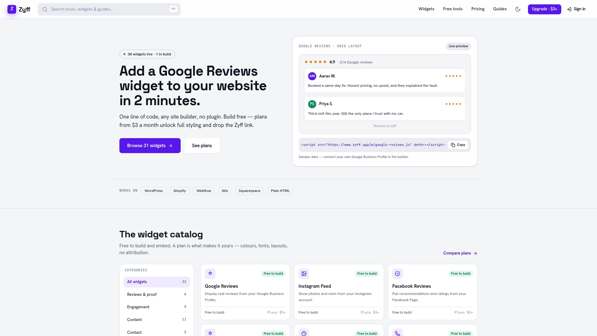
Start with the popup widget builder and pick a template that matches your offer, whether that’s a discount modal, an exit-intent recovery popup, or a slide-in teaser. From there, set your suppression rules (exclude existing subscribers), your trigger (scroll depth, delay, or exit intent), and your required fields, ideally just email. The accessibility basics, visible close button, keyboard support, ARIA labels, come built into every template, so you’re not troubleshooting compliance after launch.
Once the popup is configured, embed it with a single line of code on any site builder, no matter what platform you’re running. The free plan lets you build and test without a credit card. When you’re ready to remove Zyff branding, save multiple widget variations, or unlock advanced styling, paid plans start at $3 a month and scale up as your list and your testing needs grow. Head to the widget builder to see the full toolset before you commit to anything.
Sources
FAQ
What Does Email Capture Mean?
Email capture is the process of collecting a visitor’s email address, usually through a signup form or popup, in exchange for a discount, content, or updates. It’s the first step in turning an anonymous website visitor into a contact you can market to directly through email.
How Do You Get an Email Popup on Your Website?
Most site builders and CMS platforms support popups either through a native feature, a plugin, or an embedded widget added with a single line of code. A tool like Zyff’s popup widget lets you design, preview, and embed a popup on any site, including WordPress, without touching the site’s underlying code.
How Do I Stop the Email Signup Popup From Reappearing in My Inbox App?
That’s a different issue from marketing popups. Login prompts or feature announcements inside apps like Outlook are controlled by the app’s own settings, usually under notification or account preferences, not by any website’s popup tool. Check the app’s settings menu for a dismiss or “don’t show again” option tied to that specific prompt.
How Often Should an Email Signup Popup Appear to the Same Visitor?
Most guides recommend capping display frequency at once per session, and no more than once every few days for a returning visitor who hasn’t converted. Pair that cap with suppression rules that hide the popup permanently once someone signs up, so you’re never asking a subscriber twice.
What’s a Realistic Conversion Rate to Expect From an Email Popup?
Average lead capture popups convert between 4% and 4.8% of visitors, while top-performing campaigns can reach 25% or higher. The difference usually comes down to targeting, offer relevance, and how well the trigger matches visitor intent, not the popup format alone.