One-Line Announcement Bar Design for Designers & Devs
One-Line Announcement Bar Design for Designers & Devs

A good announcement bar does exactly one job: it carries one timely message and, when appropriate, one primary action. Keep it dismissible unless the message is genuinely urgent, and if you have more to say than a single line allows, link out to a modal or a dedicated page rather than cramming it in.
TL;DR:
- Dismissible promo bars should be short, with one clear CTA, and linked to details if message length exceeds a single line.
- Contrast and minimal animation are crucial, ensuring visibility without competing with brand colors or causing distraction on desktop and mobile.
- Implementation requires careful testing for truncation, focus order, and touch targets, especially at narrow screen widths and high zoom levels.
- Accessibility rules demand visible focus indicators, large touch targets, and non-truncated content with links to further information.
- Using an embeddable widget simplifies cross-platform consistency and ensures correct behavior across devices and page types.
Table of Contents
- Types of announcement bars and when to use each
- Design best practices: copy, layout, contrast, and mobile sizing
- Technical implementation patterns and developer checklist
- Accessibility and WCAG considerations for announcement bars
- Platform quick notes: Shopify, Squarespace, and Framer
- Inspiration and practical examples
- Tools and resources for building an announcement bar
- What building widgets has taught me about priorities
- Try Zyff’s announcement bar widget
- Sources
- FAQ
Types of announcement bars and when to use each
Not every message deserves the same treatment. A promo or sales bar works best with short copy (five to eight words) and a direct CTA like “Shop the sale” or “Get 20% off.” Urgency or countdown bars suit limited-time offers, but the timer needs a clear end state so the bar does not just vanish into a stale message.
Shipping-threshold bars should show progress toward free shipping or a discount without blocking the cart button beneath them. Status or maintenance bars are the one case for persistent, non-dismissible treatment, and only when the information affects every visitor site-wide. Newsletter or lead-gen bars work better as a teaser than a form: give one line of value and send interested visitors to a modal or signup page.
- Promo/sales: short copy, one CTA, dismissible.
- Urgency/countdown: clear deadline, visible end state.
- Shipping threshold: progress indicator, no CTA overlap.
- Status/maintenance: persistent only when critical.
- Newsletter: teaser line linking to a focused signup.
This framing matches the guidance from HarvardSites’ design system, which treats the announcement banner as a single-purpose tool rather than a catcall for marketing copy.
Design best practices: copy, layout, contrast, and mobile sizing
Readable bars stay short. Aim for a single line that fits without wrapping on common screen widths, roughly 40 to 60 characters including the CTA. Longer messages almost always read better as a headline plus a link to more detail.
Contrast matters more than brand matching. The bar needs to stand out from the page below it, but it should not fight your primary brand color for attention; a slightly muted accent usually reads better than a saturated one used elsewhere for buttons.
Animation should be minimal. A brief entrance (a slide or fade under 300 milliseconds) is fine; looping motion, blinking text, or auto-scrolling messages tend to distract more than inform, and Nielsen Norman Group’s sticky header guidance specifically warns against gratuitous animation in persistent UI elements.
On mobile, tap targets for the close button and CTA should measure at least 44 by 44 CSS pixels, and the bar itself should never overlap or hide the navigation or main content beneath it.
- Copy: one line, character-conscious, no wrapping.
- Contrast: visible against the page, not competing with your CTA button color.
- Animation: short entrance only, no looping or flashing.
- Mobile: 44x44 pixel tap targets, no content overlap.
Pro Tip: Test your bar copy at your smallest supported screen width first. If it wraps to two lines there, shorten it before worrying about desktop.
Technical implementation patterns and developer checklist
A few implementation decisions shape how well the bar performs across devices and returning visits.
- Choose sticky top or sticky bottom deliberately: top bars suit announcements paired with navigation, while bottom bars work well for mobile CTAs that should not compete with a header.
- Store dismissal state in a cookie or localStorage with a sensible expiry (a day or a week, depending on message lifespan) so dismissed users are not shown the same bar on every visit.
- For countdown timers, sync against a server timestamp when possible and fall back to client time with a visible reference point if JavaScript or the clock is unreliable.
- Use the bar as a teaser: route anything longer than one line to a modal or landing page instead of expanding the bar itself.
- Before launch, test truncation at narrow widths, keyboard focus order, browser zoom up to 200%, anchor-link jumps that might land under the bar, and how the bar behaves when a mobile keyboard is open.
Skipping the QA pass is where most bars break: a message that looks fine at 100% zoom on a laptop can truncate badly at 150% zoom on a phone.
Accessibility and WCAG considerations for announcement bars
Announcement bars sit at the top or bottom of the viewport, which puts them directly in the path of keyboard and screen reader users. WCAG 2.2 added success criteria that apply directly here, including rules that a focused element must not be obscured by other content, such as a sticky bar covering it.

Keyboard operability matters as much as visual design: both the dismissal control and any CTA need a visible focus indicator and must be reachable in a logical tab order. Touch and click targets should be large enough to avoid accidental taps, with an equivalent keyboard or screen reader path for every action available by mouse.
Never truncate meaningful content without an escape route. If the message does not fit, link to a modal or page rather than cutting it off mid-sentence.
- Focus not obscured: check that tabbing never lands behind the bar.
- Visible focus: dismissal and CTA controls both need a focus outline.
- Target size: buttons sized for touch, not just for mouse clicks.
- No silent truncation: long content gets a link, not a cut-off line.
One clear finding from the standard: WCAG 2.2’s newer success criteria specifically address keyboard focus visibility and target size, both of which are common failure points in sticky UI components like announcement bars.
Platform quick notes: Shopify, Squarespace, and Framer
Each platform has its own constraints worth knowing before you design.
- Shopify: the announcement component enforces strict maximum heights, and Shopify’s own developer documentation notes that content beyond that height is truncated rather than scrollable, so treat the bar as a teaser and route detail to a modal. Announcements can also surface on checkout, thank-you, and customer account pages, which have their own space limits.
- Squarespace: the built-in announcement bar appears site-wide on every page except cover pages, with its own styling controls separate from your site fonts and colors, and availability depends on your plan according to the Squarespace Help Center.
- Framer and other builders: most rely on plugins or widgets, which trade some native polish for faster setup.
If you work across more than one platform, an embeddable widget gives you consistent styling without rebuilding the bar for each site.
Inspiration and practical examples
A few short templates to adapt directly:
- Promo: “20% off everything today. Shop now.”
- Countdown: “Sale ends in 04:12:33. Grab yours.”
- Shipping threshold: “$12 away from free shipping. Keep browsing.”
- Maintenance: “Site maintenance tonight, 11 PM to 1 AM ET.”
- Newsletter: “Get 10% off your first order. Join the list.”
Layout choices matter too: a centered single line reads calmest, a split message-plus-CTA layout suits promos, and a small icon paired with text helps status or shipping bars scan faster. Save a strong accent color for genuine urgency; use your inline brand color for routine promos so the bar does not compete with more important calls to action elsewhere on the page.
Tools and resources for building an announcement bar
Building a bar from scratch means handling dismissal state, responsive sizing, and accessibility yourself. An embeddable widget handles all three consistently, and lets you install the same bar across a Shopify store, a Squarespace site, or a custom build without rewriting code for each.
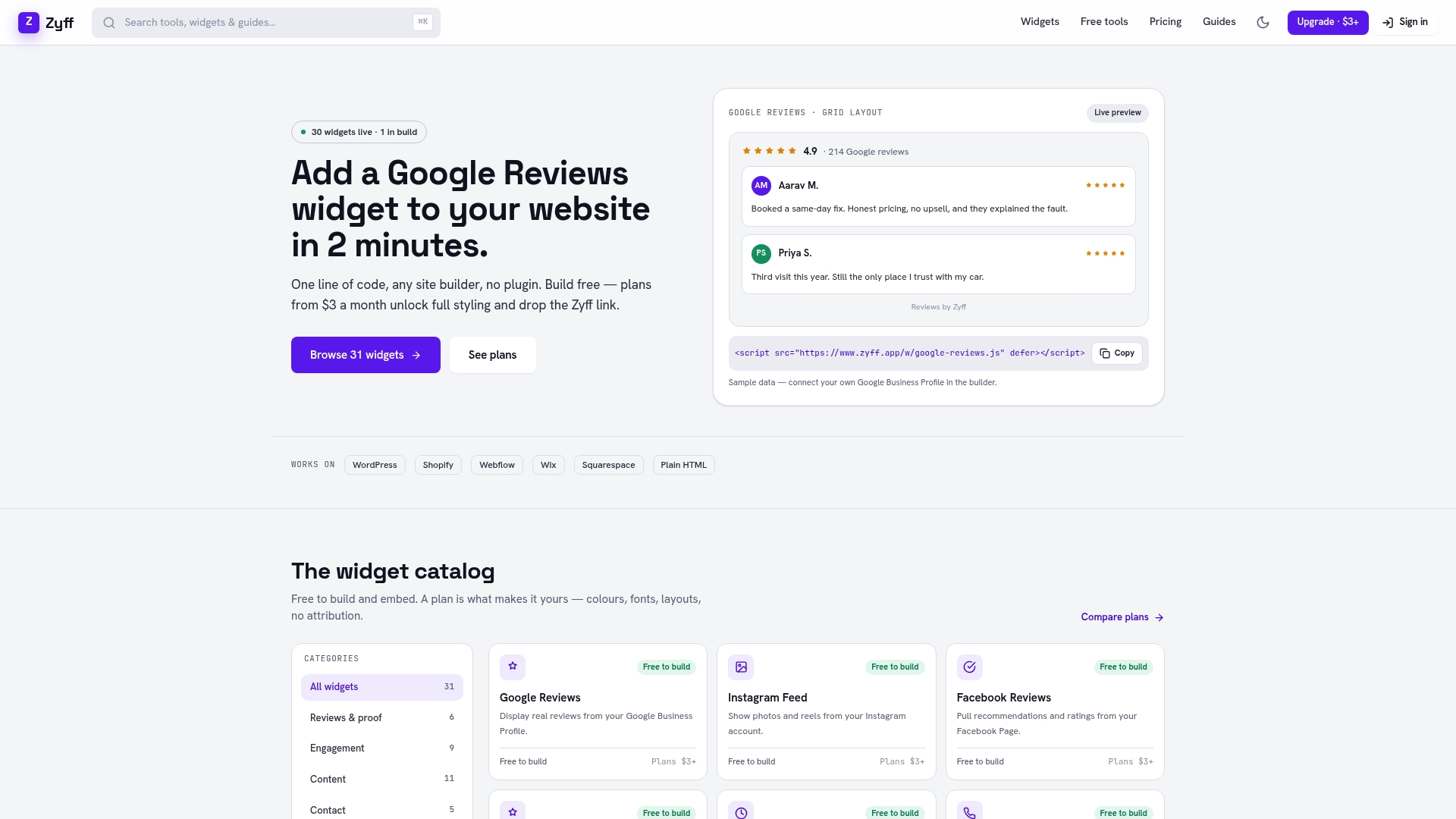
Zyff’s announcement bar widget is built for exactly this: preview and style the bar, then embed it with one line of code on any site. It sits alongside Zyff’s broader widget builder, which includes 49 free tools that stay unmetered on every plan, no account required.
- Cross-platform install with a single embed snippet.
- Preview and style before publishing, no rebuild per platform.
- Free tier covers the core widget; paid plans add higher save limits and branding removal, detailed on the pricing page.
What building widgets has taught me about priorities
Clarity beats cleverness every time: a plain, one-line message with a clear action outperforms a witty line nobody parses on the first pass. I have seen a bar’s CTA text get cut off entirely on a common phone width because nobody tested it below tablet size, which is why testability belongs next to clarity and accessibility on any checklist. Test different tones and CTA wording against each other rather than guessing which one lands.
— Ashok
Try Zyff’s announcement bar widget
Designing the bar is the easy part. Making it appear correctly across your site, your checkout page, and every visitor’s phone is where most teams lose time, and that is the part Zyff’s announcement bar widget handles for you with one line of code on any site builder.
Start on the free plan, which keeps every core tool unmetered with no account required. When you need more saved widgets, higher view limits, or branding removed, the paid plans start at $3 per month on the Basic plan, moving up through Pro at $6, Premium at $12, and four Enterprise tiers for higher-volume sites.
- Preview the bar, style it to match your brand, then copy one embed line.
- Test dismissal behavior on both desktop and mobile right after install.
- Tab through the bar with your keyboard to confirm focus lands where expected.
- Check the CTA text at your narrowest supported screen width.
Sources
For deeper detail beyond this guide: WCAG 2.2 covers the specific focus and target-size rules referenced above, Nielsen Norman Group’s sticky header research covers broader sticky UI behavior, Shopify’s announcement component docs detail platform-specific limits, and HarvardSites’ design system frames the single-message principle this article builds on. Squarespace users can also check the Squarespace Help Center for plan-specific availability.
- HarvardSites — Drive action: announcement banner
- Nielsen Norman Group — Sticky headers: UX guidelines
- Shopify developer docs — announcement (2026-07)
- Squarespace Help Center — Add an announcement bar
FAQ
What are some creative announcement ideas?
Beyond standard promos, try a shipping-progress bar that updates as the cart total grows, a countdown tied to a specific event rather than a generic sale, or a rotating single-line message that cycles through a few short updates. Keep each variant to one message and one action so the creativity does not come at the cost of clarity.
What are some creative themes for a bar design?
Common themes include product launches, limited-time offers, shipping thresholds, newsletter signups, and maintenance notices, each suited to a different visual treatment. A launch or sale theme can use a bolder accent color, while a maintenance or status theme reads better in a neutral, low-key style since it is informational rather than promotional.
How do I make the announcement bar sticky on Shopify?
Shopify’s built-in announcement component is designed to appear as a persistent, high-visibility element, including on checkout and account pages, but it enforces strict height limits according to Shopify’s developer documentation. For more styling control across your storefront, an embeddable widget like Zyff’s announcement bar can be added with one line of code and kept sticky independent of theme limitations.
Where do I find the announcement bar in Squarespace?
The announcement bar option lives in Squarespace’s site-wide settings, where you can enable it, add a message and link, and style it separately from your main site design according to the Squarespace Help Center. It then appears on every page of the site except cover pages, and availability can depend on your plan.