Accordion Accessibility: Copy Paste Markup and CI Tests for Developers
Accordion Accessibility: Copy Paste Markup and CI Tests for Developers

Use the native <details> and <summary> elements whenever your styling and behavior needs allow it. When you need a custom build instead, follow the W3C ARIA Authoring Practices pattern: a button wrapped in a heading, a synced aria-expanded state, and a collapsed panel that is actually removed from the accessibility tree. This guide walks through the markup, keyboard rules, and tests that make those three rules hold up in production.
TL;DR:
- Use accordions for scannable FAQs or long reference sections, but keep deadlines and safety warnings visible because hidden content adds clicks and can be missed.
- Custom headers need a button inside a heading, synchronized aria-expanded and aria-controls values, and collapsed panels hidden from assistive technology, not just visually concealed.
- Test with a keyboard and screen reader, checking Enter and Space, heading navigation, visible focus at 200% zoom, and synchronized panel state after every toggle.
- Allow multiple panels to remain open so readers can compare answers; exclusive accordions make them close one section before opening another.
Table of Contents
- When should you use an accordion instead of other patterns?
- Core WCAG and ARIA requirements for accordions
- Markup patterns and the pitfalls that break them
- Keyboard behavior and focus management
- A testing and QA checklist you can run before shipping
- Dos and don’ts for accordion accessibility
- What we’d default to if we were building this today
- A simpler path: accessible FAQ widgets without the custom build
- FAQ
- Sources
When should you use an accordion instead of other patterns?
An accordion groups several disclosures, single expandable regions, under their own headings so a reader can open one section without losing the others. A lone disclosure (one expandable block, like a “read more” link) does not need this grouping.
Accordions work well for:
- FAQ pages where visitors scan questions before picking one to read.
- Long reference content split into labeled chunks, like product specs or policy sections.
- Progressive disclosure that keeps a page short until someone asks for more.
They work poorly when readers need to compare content across sections at a glance, or when the hidden content is critical information a visitor might miss entirely, like a shipping deadline or a safety warning. An accordion trades scrolling for extra clicks and taps, and that trade only pays off when hiding content actually helps rather than hides something people need.
Core WCAG and ARIA requirements for accordions
The native <details> and <summary> elements are the easier path: browsers already expose the open and closed state to assistive technology and handle keyboard activation for you, so there is nothing extra to wire up.
When native markup cannot deliver the design you need, a custom accordion has to replicate what the browser would have done automatically:
- Each header button carries
aria-expanded="true"or"false", updated the instant the panel’s visible state changes. - Each header button carries
aria-controlspointing to the unique id of the panel it opens. - A collapsed panel is hidden with the
hiddenattribute ordisplay: noneso screen readers skip it entirely, not just visually. - Each button sits inside a heading element (
<h2>,<h3>, and so on) so screen reader users can jump between sections with heading navigation, a requirement rooted in WCAG’s Info and Relationships criterion. - Nothing interactive gets nested inside the header alongside the button; if a panel should not collapse at all,
aria-disabledon the button is the right signal instead of removing it.
One real button, a synced aria-expanded, and a heading wrapper are the three essentials for an accessible accordion. Skip any of them and keyboard or screen reader users lose track of what is open, according to Accessibility. The same guide calls the golden rule of ARIA worth repeating here: no ARIA is better than bad ARIA, so reach for it only when native HTML cannot do the job.
Markup patterns and the pitfalls that break them
The native pattern is short on purpose:
<details>
  <summary>What is your return policy?</summary>
  <p>Items can be returned within 30 days of delivery.</p>
</details>
Styling it is the catch. The default disclosure triangle, animation support, and cross-browser spacing all vary, so teams with strict design requirements often step up to a custom build instead.
A minimal custom pattern looks like this:
<h3>
  <button aria-expanded="false" aria-controls="panel-1" id="header-1">
    What is your return policy?
  </button>
</h3>
<div id="panel-1" role="region" aria-labelledby="header-1" hidden>
  <p>Items can be returned within 30 days of delivery.</p>
</div>
Every id on the page needs to be unique, and the button’s visible text should double as its accessible name rather than relying on a separate aria-label that might drift out of sync.
Animation is where most implementations slip. A panel sliding open with CSS still needs its hidden attribute and aria-expanded value flipped at the right moment, not after the transition finishes and not only on click with no corresponding state update. The most common failure the Accessibility.Build guide calls out is a toggle that only swaps a CSS class: the panel looks closed, but assistive technology still finds it in the tree because nothing told it otherwise.

Keyboard behavior and focus management
A correct accordion supports these interactions:
- Tab moves focus to each header button in document order, same as any other interactive element on the page.
- Enter or Space toggles the focused button’s panel open or closed, which a native
<button>element gives you automatically. - Arrow keys, Home, and End are optional enhancements for long accordion lists, useful but never a replacement for Tab reaching every button.
- In exclusive, single-open accordions, opening one panel means updating
aria-expandedon both the button you just opened and the one you just closed.
Visible focus indicators need to satisfy WCAG’s focus-visible and focus-order criteria, which means testing your focus ring at 200% zoom and against whatever default styles the browser or a user’s custom stylesheet might apply.
Pro Tip: Test your focus outline with the browser’s default font size doubled before you ship. Thin or low-contrast rings tend to disappear first.
A testing and QA checklist you can run before shipping
Manual testing catches what automated tools miss. Walk the accordion using only the keyboard, then verify the same flow with NVDA, JAWS, or VoiceOver, including a pass where you jump between sections using heading-list navigation instead of Tab.
Automated scanners still earn a place in the workflow, but they have limits. A headless-browser script that toggles every header and checks that aria-expanded and the panel’s hidden state actually flip is one of the few checks that catches state-sync bugs scanners routinely miss. Tools like AccessWiser outline two-pass NVDA and Firefox testing routines that work well alongside this kind of script.
Run through this list before merging:
- Keyboard-only walk: every button reachable, every toggle works with Enter and Space.
- Screen reader pass: opened and closed states announced correctly, headings navigable.
- Progressive enhancement check: if your custom build depends on JavaScript, confirm content is still reachable, or degrades gracefully, when scripts fail to load.
- CI check: a small Playwright or Puppeteer script that opens each panel and asserts
aria-expandedandhiddenupdate together.
The USWDS accordion component documents its own accessibility test results publicly, including the kinds of state-sync and focus issues these checks are meant to catch, which makes it a useful benchmark for what a passing test suite looks like.
Dos and don’ts for accordion accessibility
Do:
- Default to native
<details>/<summary>or an audited design-system component before building your own. - Wrap every header button in a heading element.
- Keep
aria-expandedaccurate at every step of the open and close cycle. - Hide collapsed panels from assistive technology, not just visually.
- Ship a focus indicator that is visible at normal and zoomed-in sizes.
Don’t:
- Build a toggle out of a
<div>or<span>instead of a real button. - Set
aria-expandedonce and forget to update it. - Nest another interactive element, like a link, inside the header button.
- Trust an automated scanner as your only accessibility check.
Before you deploy, confirm: native markup considered, headings present, aria-expanded synced, panels hidden when collapsed, keyboard flow verified, and at least one screen reader pass completed.
What we’d default to if we were building this today
Native <details> and <summary> should be the starting assumption for most teams, not the fallback. Reach for a custom build only when the design genuinely demands something the browser cannot give you, and even then, lean on a design system’s audited accordion before writing your own from scratch. Multi-expand should also be the default behavior rather than exclusive, single-open accordions: forcing a visitor to close one answer to read another adds friction that rarely matches the convenience teams think it buys them.
— Ashok
A simpler path: accessible FAQ widgets without the custom build
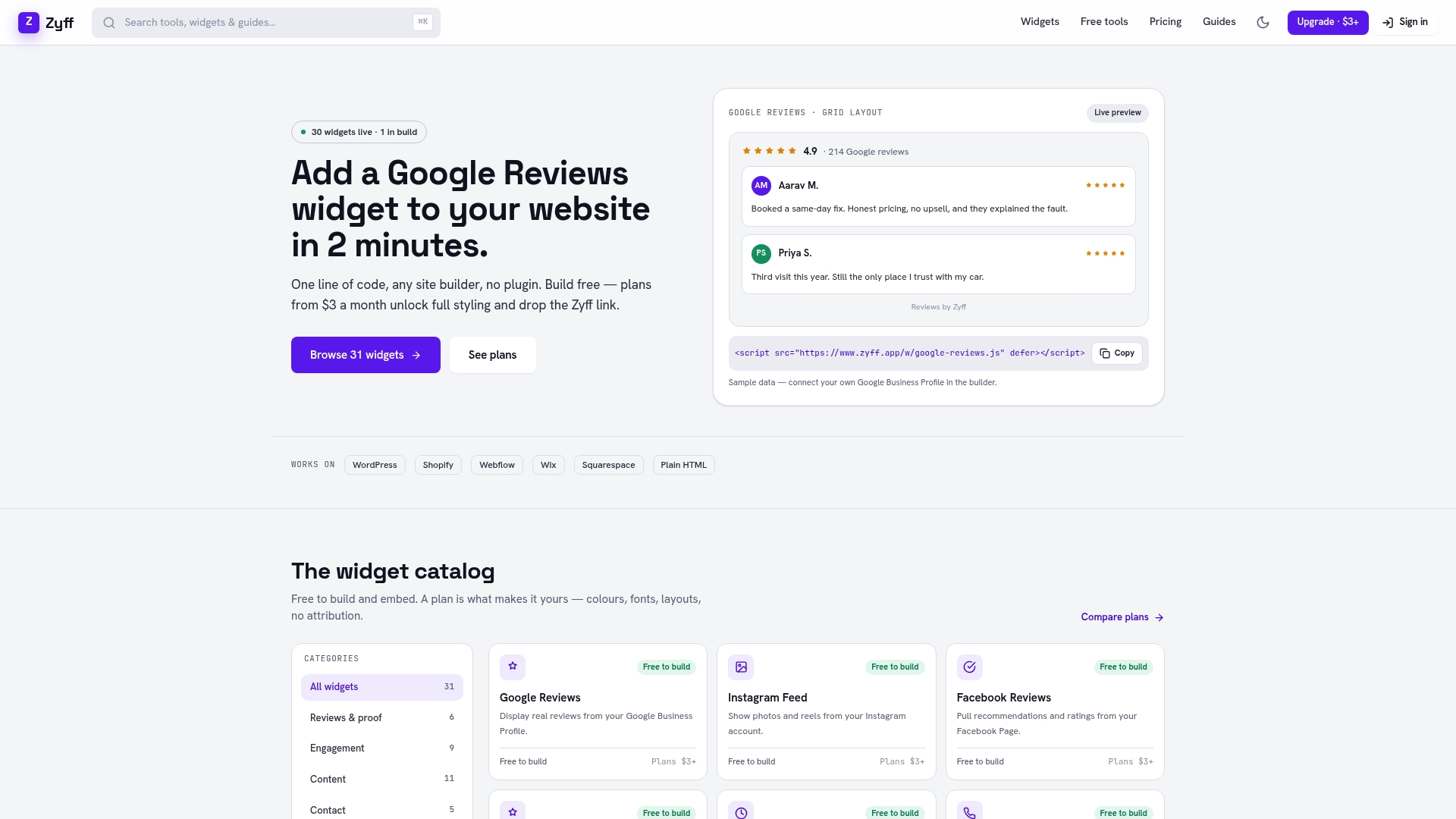
Not every team has the bandwidth to maintain a hand-built accordion, test it after every redesign, and catch regressions before they reach visitors. Our widget builder gives you an accordion-style FAQ widget that embeds with one line of code on any site builder, so the heading structure, keyboard behavior, and ARIA states stay consistent without you rewriting them each time.
A drop-in widget makes the most sense when:
- Your team is small and a custom accordion would compete with other priorities.
- You want consistent accessibility behavior across pages without re-auditing each one.
- You would rather update styling through a dashboard than touch markup every time content changes.
This option, along with many other tools, is offered free and unmetered to allow previewing and implementation of widgets before considering any paid tier for additional customization. Check our pricing page if you later want multiple saved widgets or branding removal.
FAQ
What are the accessibility guidelines for accordions?
The core guidelines come from the W3C ARIA Authoring Practices: wrap each toggle button in a heading, keep aria-expanded synced with the panel’s visible state, and hide collapsed panels from assistive technology. Native <details> and <summary> meet these requirements automatically in most browsers.
What is the difference between an accordion and a dropdown?
An accordion expands content in place on the page, pushing other elements down, while a dropdown typically overlays a floating list without changing the page’s layout. Accordions group multiple disclosures under their own headings, whereas a dropdown usually presents a single list of options or a menu.
Can Google crawl accordion content?
Google generally indexes text inside collapsed accordion panels as long as that text exists in the page’s HTML, since collapsing is a visual and ARIA state rather than content removal. Hiding content with display: none or the hidden attribute does not prevent crawling, but content loaded only after a user interaction via JavaScript can be riskier to rely on.
What are the two types of accordions?
The two common behaviors are exclusive accordions, where opening one panel closes any other open panel, and multi-expand accordions, where several panels can stay open at once. Multi-expand is generally easier for readers who need to compare information across sections, and it is the more forgiving default for most content.